January 3, 2018 — NASA is marking its 60th anniversary year with a new commemorative logo.
The aviation and space agency revealed the design on its website on Wednesday (Jan. 3).
"NASA will mark the 60th anniversary of its establishment as a U.S. government agency," a NASA press release said of the logo. "NASA has released an official logo for use in observing this milestone anniversary."
NASA, or spelled out, the National Aeronautics and Space Administration, was established on July 29, 1958, with the signing of legislation by President Dwight Eisenhower. The agency celebrates its birthday on Oct. 1, the day it formally began operation.
The NASA 60th anniversary logo was created by Matthew Skeins, a graphic artist working at NASA Headquarters in Washington, DC.
"The logo depicts how NASA is building on its historic past to soar toward a challenging and inspiring future," said the space agency.

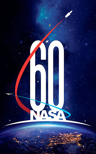
NASA's 60th anniversary logo, created by Matthew Skeins. (NASA) |
On the logo, the number "60" and "NASA" are stacked one atop the other, and they are positioned above a nighttime view of the continental United States as seen from space. The arrangement is intended to evoke a quote attributed to 17th century physicist Isaac Newton: "If I have seen further than others, it is by standing on the shoulders of giants."
NASA has used the phrase "on the shoulder of giants" to describe its own foundation, including the work done by its predecessor U.S. federal agencies, including the National Advisory Committee for Aeronautics, the Naval Research Laboratory, the Army Ballistic Missile Agency and the Jet Propulsion Laboratory (JPL), the latter now one of NASA's facilities in California.
The United States is depicted on the logo outlined by the shine from its cities. These yellow lights are meant to also symbolize NASA's vibrancy and relevance, the inspiration derived from the agency's work and the foundation of the "best and brightest" among academia and the aerospace industry upon which NASA's leadership is built.
A light blue and white arc below the "60 NASA" invokes a sunrise, as seen 16 times daily from the vantage point of Earth-orbiting spacecraft, and represents "opportunity yet to come through exploration" of the moon, Mars and other destinations beyond, according to NASA.
Two vectors, one blue and the other red, circle "60 NASA" and point to the logo's dark outer edges as if heading into the unknown. The vectors' trajectories form a "6," which is emblematic of the decades since NASA was established.

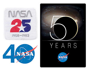
NASA's previous anniversary logos: 25th in 1983 (top left), 40th in 1998 (bottom left) and 50th in 2008 (at right). (NASA) |
The blue vector symbolizes NASA's aeronautical research and the impact on society of our first views of Earth as a "blue marble" in the vast blackness of space.
The red vector is intended to represent NASA's exploration programs, including the contributions of its commercial and international partners, to enable future astronaut missions to the moon, Mars and out into the solar system. Depicted at the tip of the red vector are the key elements of NASA's deep space architecture, the Space Launch System rocket and Orion crew vehicle.
A crescent moon, a ringed planet and a field of stars amid a nebula of light blue are meant to be symbolic of NASA's focus on science and specifically its investigations into the workings and evolution of our planet, solar system and the universe.
The 60th anniversary logo is the latest commemorative art to mark NASA's milestone years. The agency had designs to celebrate its 25th anniversary in 1983, 40th anniversary in 1998 and 50th anniversary in 2008.
