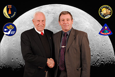
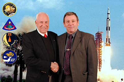
|
Author
|
Topic: 10/30-11/1: Space Lectures Jim Lovell event (UK)
|
gareth89
Member Posts: 298
From: Ireland
Registered: May 2014
|
 posted 05-04-2015 11:44 AM
   
quote:
Originally posted by Rick Mulheirn:
Such was the success of the backdrop competition for Eileen's event we would like to do the same for October.
Here's a link to my ones! (The Gemini 12 one was just for fun!) |
topmiler
Member Posts: 148
From: eastleigh, hampshire, UK
Registered: Jul 2012
|
 posted 05-04-2015 11:52 AM
  
I like Dave Johnson's Earthrise backdrops, the second one though might have the Earth partly obscured by the people in it. |
Rick Mulheirn
Member Posts: 4167
From: England
Registered: Feb 2001
|
 posted 05-04-2015 06:35 PM
   
344 tickets now sold for the second Lovell lecture on Sunday, Nov. 1. At the current rate of sale this will sell out well in advance of the event.Both the dinner and the first lecture have already sold out. |
Rick Mulheirn
Member Posts: 4167
From: England
Registered: Feb 2001
|
 posted 05-06-2015 05:14 PM
   
395 tickets have now been sold for the second Lovell lecture on November 1st; just 80 remain. The dinner and the first lecture were both sold out weeks ago! That said, one person has switched their Saturday lecture ticket to the Sunday so there is one Saturday lecture ticket available. At this time, Professor Brian Cox is expected to conduct the Q&A on the Saturday only. Please e-mail Ken directly to confirm availability and purchase. |
Rick Mulheirn
Member Posts: 4167
From: England
Registered: Feb 2001
|
 posted 05-07-2015 06:20 PM
   
Incidentally, Ken tells me his guest for April 2016 will be here April 22nd and 23rd. He has not told me who it is but I am assured he will be a very big draw... |
Dave_Johnson
Member Posts: 106
From:
Registered: Feb 2014
|
 posted 05-08-2015 08:15 PM
   
quote:
Originally posted by Tykeanaut:
I like them both, but the second one does have more balance and may suit a photo shoot better?
Thanks! The position of Earth in the second one may be problematic for poses, as it may end up being blocked by a standing person. quote:
Originally posted by topmiler:
I like Dave Johnson's Earthrise backdrops, the second one though might have the Earth partly obscured by the people in it.
Thanks! Yeah, that problem was seen immediately upon creating it, hence my creating the other one as well. |
Dave_Johnson
Member Posts: 106
From:
Registered: Feb 2014
|
 posted 05-08-2015 08:45 PM
   
Adjusted dimensions and location of Earth in the more balanced image: |
Rick Mulheirn
Member Posts: 4167
From: England
Registered: Feb 2001
|
 posted 05-09-2015 05:05 AM
   
Looks good Dave but personally, as classic an image as Earthrise may be, I still think something with a predominantly lighter back ground would be better. Earthrise would inevitably call for a lot of metallic pen use and as the signing goes on, with the best will in the world, and a good supply of metallic pens some of the signatures may become a tad "scratchy". Again, this is just my opinion but black pen is best medium for signing the photo shoot images and this image does not lend itself to that. It has been pointed out that there are not a lot lighter ground appropriate images to choose from but it occurred to me a bit of judicial photo shopping of several images in to one might be an option; says the man with about as much knowledge of Photoshop as a parsnip!  And while we are on the subject of the Lovell event, in excess of 50 tickets for the Sunday lecture have been sold in the last 4 days alone. This event is really motoring and several regulars I know missed out on dinner and the first lecture because the tickets sold so quickly. Don't delay. |
Dave_Johnson
Member Posts: 106
From:
Registered: Feb 2014
|
 posted 05-10-2015 02:08 AM
   
Ok, here's another one - from one extreme to another.  |
Tykeanaut
Member Posts: 2212
From: Worcestershire, England, UK.
Registered: Apr 2008
|
 posted 05-10-2015 03:24 PM
   
How about just the lunar surface as a background? Simple but poignant. |
Rick Mulheirn
Member Posts: 4167
From: England
Registered: Feb 2001
|
 posted 05-10-2015 03:36 PM
   
Dave, that is the kind of thing I had in mind. From a technical standpoint I think the image may be too wide. I understand why you put the earth dead centre but it does dominate somewhat.Chris, I think we used a simple moon back drop for the Mattingly event. Given Jim Lovell's Gemini exploits I think some considration should be given to those.... but these are just my opinions. The more images the better; the final decision will be made in part by the Space Lectures team, but ultimately Ken will have the final say. |
Dave_Johnson
Member Posts: 106
From:
Registered: Feb 2014
|
 posted 05-10-2015 10:54 PM
   
Ok... will try working on that last one to find a suitable "centerpiece," which I think is needed. In the meantime, here's another one. While it has a mix of dark and light background (unfortunately, I am finding this prevalent for any images that I've come across so far that would make a good backdrop), hopefully there's sufficient amount of lighter background to be suitable for signing with a sharpie.  |
Rick Mulheirn
Member Posts: 4167
From: England
Registered: Feb 2001
|
 posted 05-11-2015 03:10 AM
   
Nice Dave! Anybody else got anything to contribute? |
taylor.vans
Member Posts: 38
From: Seattle, Washington
Registered: Apr 2015
|
 posted 05-11-2015 11:07 PM
   
I tried my hand on some of Lovell's iconic missions, although I left out his other mission emblems. 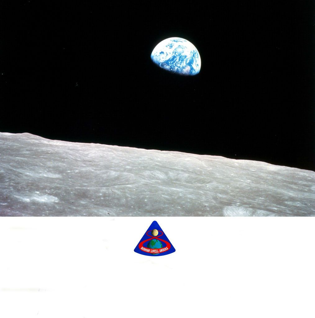 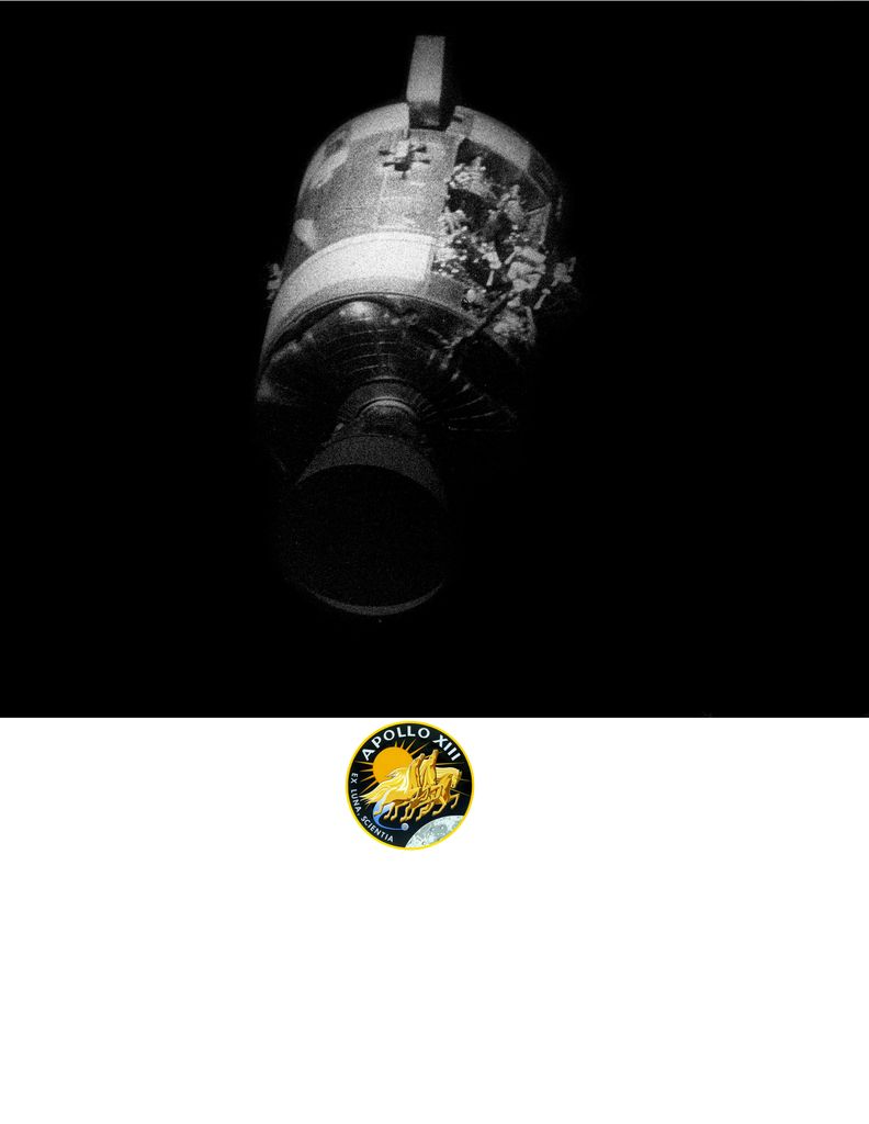
|
crash
Member Posts: 318
From: West Sussex, England
Registered: Jan 2011
|
 posted 05-12-2015 05:42 AM
   
Dave, that full Gemini version is great. I think that the Gemini program gets overlooked when the Apollo guys come to town. With Jim Lovell it might be difficult to even get the conversation around to Apollo 8 so dominant is 13. |
Robonaut
Member Posts: 259
From: Solihull, West Mids, England
Registered: Mar 2002
|
 posted 05-12-2015 06:31 AM
   
My vote should not be counted as I will not be attending but for what it is worth I do like the Gemini montage. |
cycleroadie
Member Posts: 452
From: Apalachin, NY USA
Registered: May 2011
|
 posted 05-12-2015 06:08 PM
   
Here's one I came up with. I'll clean up the Saturn V some more if it's selected.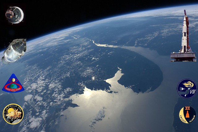 |
topmiler
Member Posts: 148
From: eastleigh, hampshire, UK
Registered: Jul 2012
|
 posted 05-13-2015 09:37 AM
  
I'm not overly keen on having the background full of odds and ends, looks too cluttered. Just need a simple relevant theme that doesn't distract from the subject astronaut. |
Rick Mulheirn
Member Posts: 4167
From: England
Registered: Feb 2001
|
 posted 05-13-2015 09:45 AM
   
Personally I liked Dave's image with the Gemini and Saturn launches. But in my opinion the Earth would need to disappear and the two shots somehow seamlessly merged in the centre of the background. Since Jim Lovell and his guests would occupy the centre ground that would suffice. |
Dave_Johnson
Member Posts: 106
From:
Registered: Feb 2014
|
 posted 05-13-2015 05:17 PM
   
Thanks for the likes for my other backgrounds.Here's the image with just the two launches. It's not completely seamless, but enough to be appealing especially since the center will be blocked.  What do you think? |
Rick Mulheirn
Member Posts: 4167
From: England
Registered: Feb 2001
|
 posted 05-14-2015 03:10 AM
   
Getting there but a tad more seamless I think... if possible. Perhaps the Saturn V exhaust and the Gemini gantry could somehow blend in to one another. Easily said!  |
Tykeanaut
Member Posts: 2212
From: Worcestershire, England, UK.
Registered: Apr 2008
|
 posted 05-14-2015 08:59 AM
   
I really like this one Dave.  Perhaps swapping the images over would achieve the blend that Rick is looking for? |
Rick Mulheirn
Member Posts: 4167
From: England
Registered: Feb 2001
|
 posted 05-14-2015 09:16 AM
   
Personally, I don't think it essential that the images are from Jim Lovell's missions; certainly not the launches anyhow.I don't think the image used for Eileen Collins's backdrop was one of her launches but it worked well from an aesthetic point of view. The Saturn V on it's own, in landscape format with the booster shifted to the right for framing purposes, leaving room for the mission patches on the opposite side might work. Nice and dynamic too. |
cycleroadie
Member Posts: 452
From: Apalachin, NY USA
Registered: May 2011
|
 posted 05-14-2015 11:57 AM
   
Correct Rick, the Collins backdrop was not one of her launches, but the vehicle was way to one side as you had suggested you wanted, it saved me trying to make one from scratch using a photo of her launches, and it was a nice hi resolution photo so I knew it would look good no matter what you did with it. |
topmiler
Member Posts: 148
From: eastleigh, hampshire, UK
Registered: Jul 2012
|
 posted 05-14-2015 03:44 PM
  
How about just having the moon and do away with all the clutter? |
Dave_Johnson
Member Posts: 106
From:
Registered: Feb 2014
|
 posted 05-14-2015 05:32 PM
   
Ok, let's try this one! |
Rick Mulheirn
Member Posts: 4167
From: England
Registered: Feb 2001
|
 posted 05-14-2015 07:19 PM
   
Another nice one Dave. |
OWL
Member Posts: 175
From: United Kingdom
Registered: Aug 2007
|
 posted 05-16-2015 05:37 AM
   
The backdrop is a very interesting and entertaining thread.
We need to be mindful that the backdrop needs to have a light area to it rather than the blackness of space particularly around the person's head in the photograph.
This could be problematic with dark haired guests. |
Rick Mulheirn
Member Posts: 4167
From: England
Registered: Feb 2001
|
 posted 05-16-2015 05:41 AM
   
...and green haired guests!  Joking aside, it is an idea not to wear green clothing as it takes on the image of the back drop. The photographers can "photoshop" a neutral colour on to green clothing but the finished result can look a tad odd. |
paulus humungus
Member Posts: 400
From: Burton, Derbyshire, England
Registered: Oct 2005
|
 posted 05-17-2015 09:59 AM
   
I have a spare ticket for the Saturday lecture to be hosted by Prof Brian Cox if anyone prefers that option. Please email me if interested. Thanks |
Rick Mulheirn
Member Posts: 4167
From: England
Registered: Feb 2001
|
 posted 05-18-2015 03:32 AM
   
We have touched already upon the choice of background image for the Jim Lovell photo-shoot backdrop. Specifically whether or not this should be from one of his missions. I would like to better understand people's views of this point — canvas opinion if you like.I trained and worked as a photographer and designer many moons ago and think the aesthetics of the image are what matters. If there is an image from one of Capt. Lovell's missions that fits the bill all well and good. But if not, a generic image be that of the moon, a launch or such is perfectly acceptable. That is what was done for the Eileen Collins event and the backdrop looked great. The question will also help to settle "artistic differences" between myself and another member of the Space Lectures team. I am not prepared to name names (Mrs OWL  ) but under pain of assault with a rolling pin, attack from her stuffed dead cat and even a chinese burn, she is of the opinion the image should be from one of Lovell's missions. ) but under pain of assault with a rolling pin, attack from her stuffed dead cat and even a chinese burn, she is of the opinion the image should be from one of Lovell's missions. When all is said and done the photo will provide a lasting memento for those meeting Capt. Lovell on the day and it has to look good. I welcome people's opinions and in the meantime, I am going for a fitting of my new "Everlast" boxing gloves! |
topmiler
Member Posts: 148
From: eastleigh, hampshire, UK
Registered: Jul 2012
|
 posted 05-18-2015 05:33 AM
  
This is a once in a lifetime opportunity to have a decent photo taken with Jim Lovell. I would rather have him and I, as the subjects of the photo, the main feature with a simple background such as the moon, as with Ken Mattingley, without a collection of assorted bric-a-brac filling up the surrounding area. |
cycleroadie
Member Posts: 452
From: Apalachin, NY USA
Registered: May 2011
|
 posted 05-18-2015 07:23 AM
   
Finding the right image that will look good as a background, keeping in mind Rick's general requirements, AND keeping it specific to one of Lovell's missions will be a tall order without doing a lot of manipulation to the photo to make it work right, so in the end, while you might have say his launch vehicle in the picture, the photo itself will have been changed extensively.All the iconic photos (The Earthrise from Apollo 8, the damaged Service Module from 13, Gemini 6 in orbit, etc.) are all dominated with the blackness of space and are therefor really not suited for a photo background. I appreciate the desire for an actual picture from one of his missions, and in fact I hunted extensively for one of Collins launches that would fit the bill, but none were available that fitted the requirements that Rick had, I ended up with the background of Atlantis launching on STS-135, with the caveat that it was an Orbiter she had flown before. One last thought, don't forget that in the time frame of Lovell's missions, everything was done on film, so you have a LOT less pictures to chose from. Space requirements on a mission led to a limited number of rolls on board and also on the ground. I know when I used to shoot film, I'd shoot maybe three or four rolls on a trip. My last trip to KSC to cover the EFT-1 launch I shot over 600 images over 3 days since I'm all digital now and tossing out images you do not want doesn't cost you but a few moments of your time. |
Rick Mulheirn
Member Posts: 4167
From: England
Registered: Feb 2001
|
 posted 05-18-2015 04:33 PM
   
I will post a couple of my own ideas for the Lovell back drop. They need a bit of tweeking but are there or there abouts. I have to confess, I am not responsible for the computer wizardry but the design and the images are of my choosing. 
|
Dave_Johnson
Member Posts: 106
From:
Registered: Feb 2014
|
 posted 05-18-2015 08:40 PM
   
Since the Moon as a backdrop is back on the table, so to speak, here's one. It's a shot of the far-side of the moon taken on Apollo 13. Both relevant and providing a light background for signing with a sharpie. |
crash
Member Posts: 318
From: West Sussex, England
Registered: Jan 2011
|
 posted 05-19-2015 04:18 AM
   
I agree that the backdrop must contain an area that is suitable for signing, and that the moon was the goal of the space programs but I find the Moon backdrops just a little... dull. There is no excitement in them. A lunar backdrop could be placed behind any space employee, astronomer, etc. and it would have some sort of relevance. A spacecraft however, has flames, vibration, noise, animation... now we're talking. I personally would like to see the Gemini program get centre stage for the backdrop as it will probably be the only time it features during his visit and will largely be ignored. I love the Gemini VII rendezvous images but they do lack the majority of attributes I was highlighting earlier. Just my humble opinion with apologies to all who are working hard to find a solution. (Sorry Rick, I'll make it up with a beer.  ) ) |
Rick Mulheirn
Member Posts: 4167
From: England
Registered: Feb 2001
|
 posted 05-19-2015 05:22 AM
   
Can I take it that you like the launch backdrop?Your rationale behind the moon image is correct. That was the objective for both Gemini and Apollo and it provides a goodly area for signing. It is nice and simple too; not fussy with too many bits and bobs serving as a distraction. We will get it right but we still have a bit to go. |
crash
Member Posts: 318
From: West Sussex, England
Registered: Jan 2011
|
 posted 05-19-2015 11:59 AM
   
Yes, the launch backdrop is my choice after the Dave's Gemini rendezvous image. It can be adjusted so that the Saturn V is off to the side and not obscured by the people in the centre which would occur with the Gemini shot unfortunately. |
paulus humungus
Member Posts: 400
From: Burton, Derbyshire, England
Registered: Oct 2005
|
 posted 05-19-2015 01:46 PM
   
Although I would dearly love the Apollo 8 earth rise to work, the Saturn V launch photo works really well. |
Dave_Johnson
Member Posts: 106
From:
Registered: Feb 2014
|
 posted 05-19-2015 08:55 PM
   
Here's the Gemini launch shot, slightly edited to make the rocket a bit larger and adjusted the patch locations. |



 ) but under pain of assault with a rolling pin, attack from her stuffed dead cat and even a chinese burn, she is of the opinion the image should be from one of Lovell's missions.