|
|

|
|
Author
|
Topic: NASA honors 'worm' designer Richard Danne
|
Robert Pearlman
Editor Posts: 53700
From: Houston, TX
Registered: Nov 1999
|
 posted 11-06-2023 04:00 PM
   
collectSPACE NASA dedicates giant 'worm', honors logo designer Richard DanneNearly 50 years after it was first introduced, just over 30 years since it was unceremoniously retired and only three years after making its triumphant return, NASA honored the designer behind its retro-cool, sometimes controversial but now seemingly universally loved logotype. Richard Danne, who in 1975 gave birth to the "worm" — as the simple, red type style of the word "NASA" has come to be known — was invited back to NASA's headquarters in Washington D.C. on Monday (Nov. 6) for a panel discussion about the mark's legacy and to be awarded NASA's Exceptional Public Achievement Medal. The agency also dedicated a large three-dimensional sign in the shape of the worm to Danne and two others who created the worm and first put it into use. 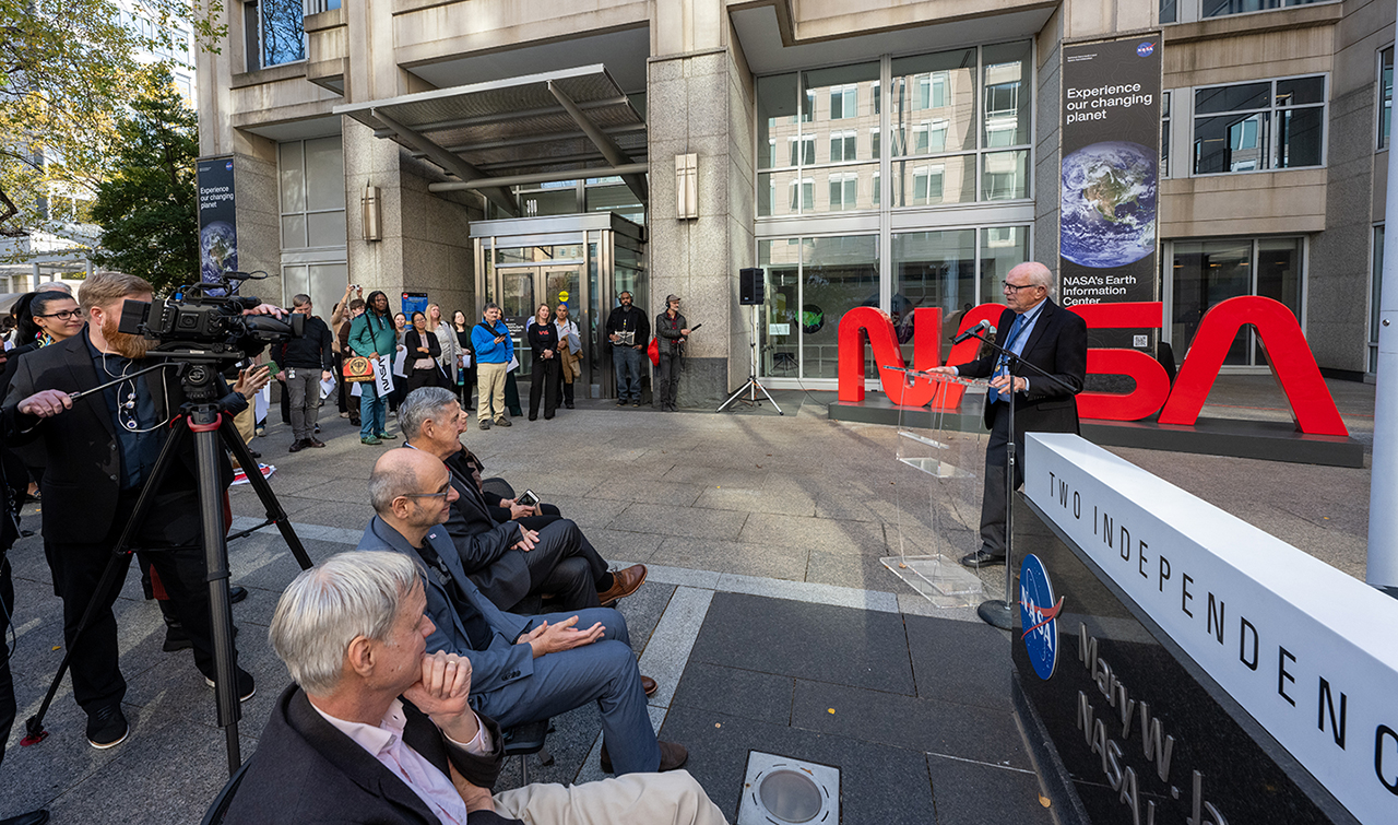 |
Philip
Member Posts: 6294
From: Brussels, Belgium
Registered: Jan 2001
|
posted 01-06-2025 04:11 AM
2025 marks the 50th anniversary of the NASA worm. We remember the Apollo-Soyuz Test Project crew wearing it on their spacesuits in June 1975, but when was the NASA worm shown for the very first time? |
Robert Pearlman
Editor Posts: 53700
From: Houston, TX
Registered: Nov 1999
|
posted 01-06-2025 12:05 PM
According to the NASA monograph "Emblems of Exploration" by Joseph and Mark Chambers, the NASA "worm" logotype was first announced in the Feb. 21, 1975 issue (Vol. 14, Issue 4) of "Researcher News," an in-house newsletter at Langley Research Center. The new symbol, reproduced here, incorporates the letters of the NASA acronym, with letters stylized and reduced to their simplest forms. The single width of the letters is designed to give a feeling of unity and technological precision to the symbol. The curves of the letters represent fluidity and continuity from a design point of view. The "As" are used without their cross-strokes to give a feeling of vertical thrust. NASA informed the other centers by sending executive stationery to each director. That stationery displayed the new NASA logotype and it would be the first time they were informed of the graphics program and image change. The centers implemented the logotype at different paces, with some resisting the change. Ames Research Center and Dryden Flight Research Facility were among the first to embrace the new look, which is where the public may have first seen the "worm" in use. | |
Contact Us | The Source for Space History & Artifacts
Copyright 1999-2025 collectSPACE. All rights reserved.

Ultimate Bulletin Board 5.47a
|
|
|
 advertisement advertisement
|


