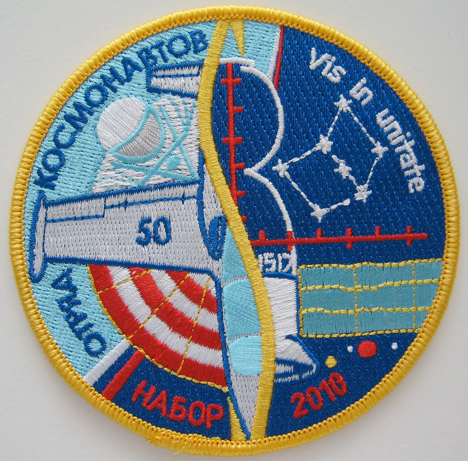
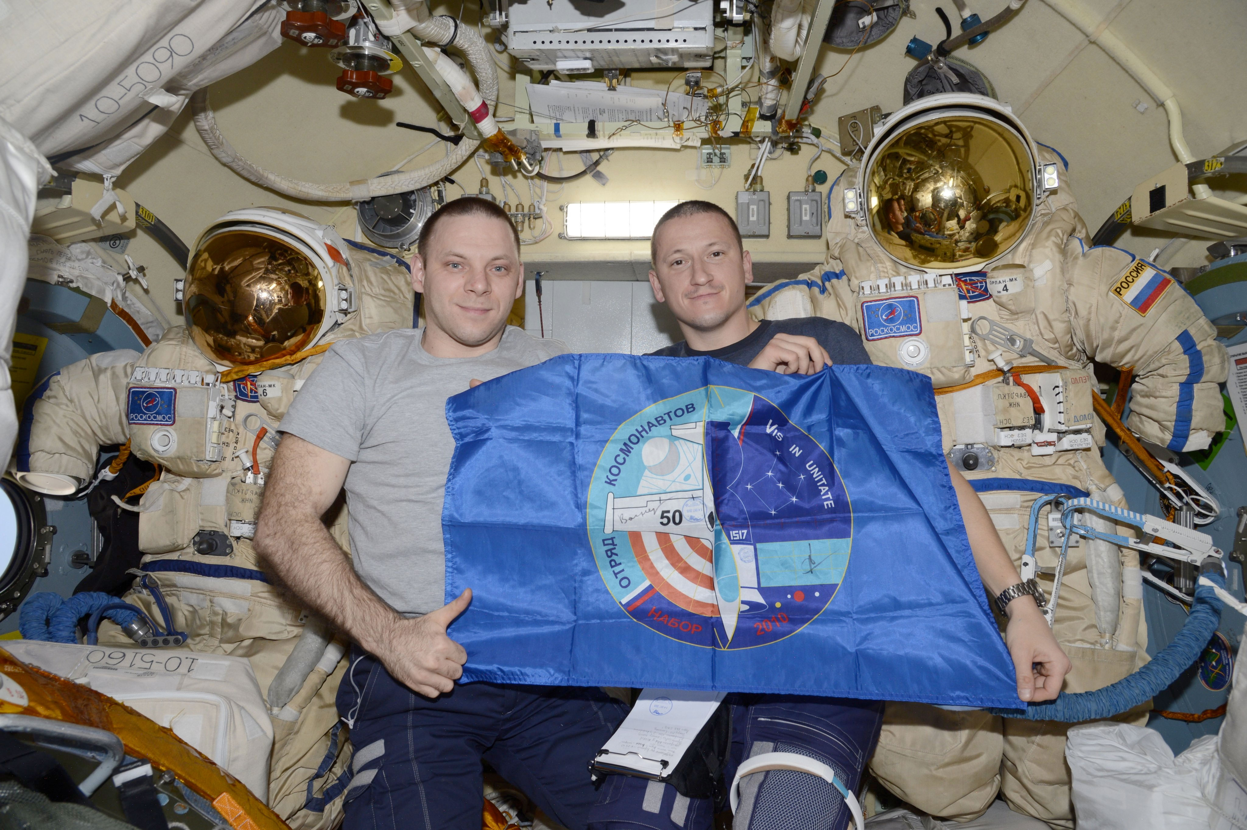
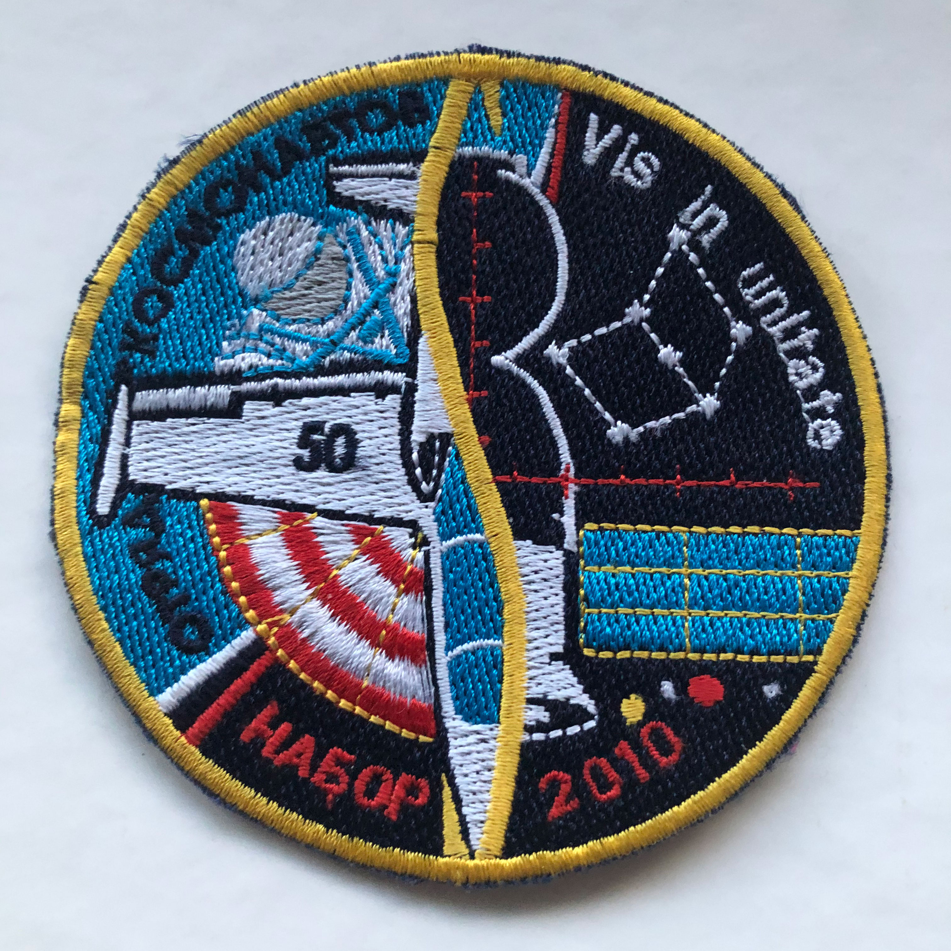
The number on the wing of the training aircraft was chosen in honor of the 50th anniversary of the first team of cosmonauts in 1960. The general shape of the logo represents the fusion of two different mediums: of air, surrounding the Earth, and space across the border represented by a spectrum showing the colors of the flag of Russia.The golden integral sign is not only a symbol of the single cosmonaut team established in 2010, but also connects the left side of the composed logo (containing elements of the cosmonaut training) and right, the embodiment of space flight. The spiral structure of this central element renders the idea of the amount of accumulated knowledge and skills necessary for the implementation of successive cycles of training the crew for spaceflight.
A constellation in the form of an open book (or laptop) represents the studies required for this team on the way from candidates to astronauts. The colors of the parachute are painted like the canopy of the return capsule as a symbol of the safe return of crews on Earth.
The moon, Mars and asteroids represent the long-range goals of human space exploration. Various technical means used in the preparation of cosmonauts are depicted on the emblem and show the wide-ranging specialties of the seven would-be astronauts: pilot, paratrooper, engineer, designer, tester and researcher.
The motto translates from Latin as "strength in unity" and is a symbol of quantity transforming into quality.
The logo was designed by Andrei Babkin with input from Sergey Kud-Sverchkov, Aleksei Khomenchuk, Sergey Prokopyev, Denis Matveev, Ivan Vagner and Sviatoslav Morozov.


 posted 10-20-2020 05:08 PM