|
Author
|
Topic: Artemis I (was: Orion EM-1) insignia
|
Robert Pearlman
Editor Posts: 54299
From: Houston, TX
Registered: Nov 1999
|
 posted 12-26-2017 07:00 AM
   
collectSPACE NASA's Space Launch System rocket gets a maiden mission patchThe maiden launch of NASA's new heavy-lift rocket now has its own mission patch. The space agency recently finalized the insignia representing Exploration Mission-1 (EM-1), the first flight of its Space Launch System (SLS), presently targeted for late 2019. The EM-1 test flight will send an uncrewed Orion spacecraft on a three-week mission to the moon and back. 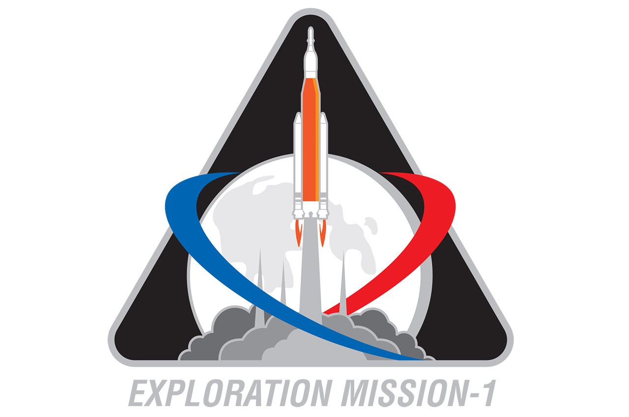 |
328KF
Member Posts: 1391
From:
Registered: Apr 2008
|
posted 12-26-2017 10:53 AM
Tim Gagnon (KSCArtist), please help these people.  |
Hart Sastrowardoyo
Member Posts: 3473
From: Toms River, NJ
Registered: Aug 2000
|
posted 12-26-2017 11:35 AM
Given the projected infrequency of launches, maybe they should use the main part of the logo with a rectangular block underneath (like was projected for the space shuttle program) with either "Exploration Mission-2," etc. or the objective ("Circumlunar" / "Deep Space Gateway" / "Asteroid capture") and so on.... |
Panther494
Member Posts: 582
From: London UK
Registered: Jan 2013
|
posted 12-26-2017 01:29 PM
My first reaction was "really, is that it." Very disappointing. |
OV-105
Member Posts: 923
From: Ridgecrest, CA
Registered: Sep 2000
|
posted 12-26-2017 01:32 PM
Looks like it is from an 80's video game. |
Robert Pearlman
Editor Posts: 54299
From: Houston, TX
Registered: Nov 1999
|
posted 12-26-2017 01:50 PM
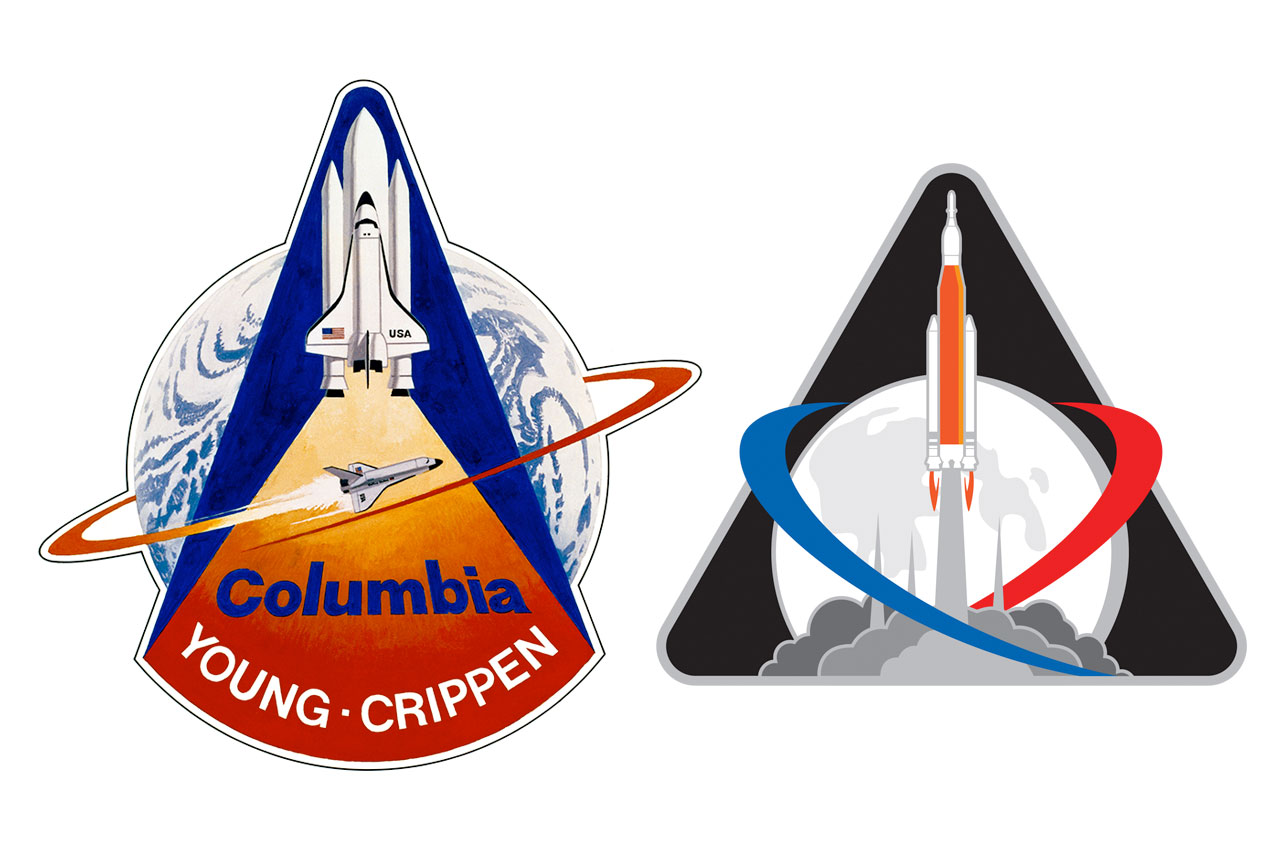
It is interesting you mention the 1980s; someone else mentioned to me that it evokes the STS-1 mission patch. |
pupnik
Member Posts: 122
From: Maryland
Registered: Jan 2014
|
posted 12-26-2017 03:42 PM
In general I don't mind it, except for the excessive use of grays. "Neutral" shouldn't be the primary color. (My first impression was actually that it was closer to the STS logo rather than STS-1.) |
Fra Mauro
Member Posts: 1739
From: Bethpage, N.Y.
Registered: Jul 2002
|
posted 12-26-2017 05:39 PM
Not exciting — poor color choices, plus the moon should've been included somewhere. |
Robert Pearlman
Editor Posts: 54299
From: Houston, TX
Registered: Nov 1999
|
posted 12-26-2017 06:14 PM
Not sure if you're being sarcastic, but that large orb behind the launching rocket is the moon. |
Panther494
Member Posts: 582
From: London UK
Registered: Jan 2013
|
posted 12-26-2017 06:28 PM
Yep, meant to be the moon. Just very poorly executed. Looks more Earth like. |
Liembo
Member Posts: 895
From: Bothell, WA
Registered: Jan 2013
|
posted 12-26-2017 08:22 PM
I had a design in the ring, but they indicated there was "a great deal of sensitivity" to have the full SLS stack featured because it is the first flight and my design did not. At one point they responded that the "Exploration Mission 1" label might change, but it looks like they are sticking with that. I haven't seen any notes about what the red/blue features are in the final approved design above. |
Panther494
Member Posts: 582
From: London UK
Registered: Jan 2013
|
posted 12-26-2017 11:21 PM
The red and blue vectors in the design are noted as: "symbolizing the EM-1 flight trajectory, while also infusing the colors of the U.S. flag to the insignia." |
oly
Member Posts: 1488
From: Perth, Western Australia
Registered: Apr 2015
|
posted 12-26-2017 11:35 PM
A far better design than the new deep space exploration systems logo. |
mode1charlie
Member Posts: 1491
From: Honolulu, HI
Registered: Sep 2010
|
posted 12-27-2017 05:09 AM
Looks like they outsourced this design to freelogoservices.com. |
p51
Member Posts: 1790
From: Olympia, WA
Registered: Sep 2011
|
posted 12-27-2017 09:39 AM
I like it. Too many of the previous designs were what my art school teacher referred to as coming from the design school of, "Ten pounds of idea in a 2 pound bucket."It shows very good design work. |
Fra Mauro
Member Posts: 1739
From: Bethpage, N.Y.
Registered: Jul 2002
|
posted 12-27-2017 04:28 PM
quote:
Originally posted by Robert Pearlman:
Not sure if you're being sarcastic...
Sorry, Robert, I wasn't being sarcastic. It didn't strike me it was the moon until I looked closer. |
lucspace
Member Posts: 527
From: Hilversum, The Netherlands
Registered: Oct 2003
|
posted 12-28-2017 07:21 AM
A weak design, not very imaginative in my opinion. And it appears to include an honest mistake with the boosters trailing flames and a column of smoke coming from the rocket's main engines, which should be the other way around. A missed opportunity to produce a striking design for an important mission... |
cspg
Member Posts: 6377
From: Geneva, Switzerland
Registered: May 2006
|
posted 12-28-2017 09:08 AM
Not great but better than the Deep Space Exploration logo... |
Robert Pearlman
Editor Posts: 54299
From: Houston, TX
Registered: Nov 1999
|
posted 12-28-2017 09:38 AM
quote:
Originally posted by lucspace:
...a column of smoke coming from the rocket's main engines
That is a representation of the tower from the mobile launcher, not a plume. |
Moonbase Alphan
Member Posts: 137
From: Space City, Texas
Registered: Dec 2006
|
posted 12-28-2017 11:02 AM
quote:
Originally posted by p51:
It shows very good design work.
Concur.Tired of the patches that are "everything + the kitchen sink" designs that also inevitably pile on the Photoshop gimmicks, such as gradient rays and rainbows. Keep it simple. |
David C
Member Posts: 1463
From: Lausanne
Registered: Apr 2012
|
posted 12-28-2017 02:50 PM
I find it spectacularly uninspiring. Logo by corporate committee. |
SpaceAngel
Member Posts: 513
From: Maryland
Registered: May 2010
|
posted 12-29-2017 08:55 AM
Talk about déjà vu... |
Robert Pearlman
Editor Posts: 54299
From: Houston, TX
Registered: Nov 1999
|
posted 01-19-2018 10:22 AM
NASA formally released the Exploration MIssion-1 insignia (what they are calling the "identifier") today: The Exploration Mission-1 artwork showcases the Space Launch System (SLS) rocket carrying the Orion spacecraft and lifting off from Launch Pad 39B at NASA's Kennedy Space Center in Cape Canaveral, Florida. The triangular shape represents the three main programs that comprise NASA's Deep Space Exploration Systems: Orion, SLS, and Exploration Ground Systems, and is a classic shape for NASA mission emblems dating back to the shuttle era. Several elements within the design carry symbolic meaning for this historic flight. The silver highlight surrounding this patch gives nod to the silver Orion spacecraft, including the European service module that will be voyaging 40,000 miles past the Moon in deep space. The orange rocket and flames represent the firepower of SLS. The setting is historic Launch Pad 39B, represented by the three lightning towers. The red and blue mission trajectories encompassing the white full Moon proudly emphasizes the hard work, tradition, and dedication of this American led-mission while also embracing NASA's international partnership with ESA (European Space Agency) as both agencies forge a new future in space. The Exploration Mission-1 emblem was designed in collaboration by the creative team working for the Deep Space Exploration Systems programs, which includes Orion, SLS, and Exploration Ground Systems, located at NASA Headquarters in Washington, Glenn Research Center in Cleveland, Johnson Space Center in Houston, Marshall Space Flight Center in Huntsville, Alabama, and Kennedy. Because the maiden mission of SLS and Orion is uncrewed, the program teams had the rare opportunity to conceive the mission identifier. Exploration Mission-2, which will fly with crew, will have an insignia designed by NASA's Astronaut Office with the help of the crew that will fly aboard the most capable deep space system to take flight. |
Liembo
Member Posts: 895
From: Bothell, WA
Registered: Jan 2013
|
posted 02-22-2018 10:59 PM
First photo I've seen of it in patch form, via NASA Orion exploration mission planning lead Nujoud Merancy on Twitter: 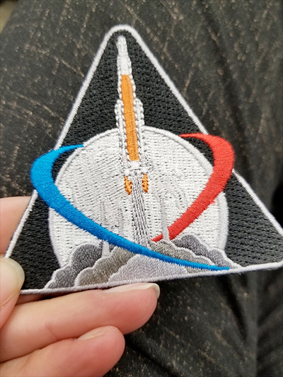 |
ddrwilli
Member Posts: 80
From: Pataskala, Ohio
Registered: Nov 2005
|
posted 02-23-2018 03:47 PM
Yikes! |
lucspace
Member Posts: 527
From: Hilversum, The Netherlands
Registered: Oct 2003
|
posted 03-07-2018 06:08 AM
An American kid's tv show used something similar but better looking some time ago...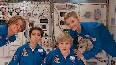 |
Panther494
Member Posts: 582
From: London UK
Registered: Jan 2013
|
posted 03-07-2018 09:27 AM
The stitching around the SLS and boosters looks horrible. |
Robert Pearlman
Editor Posts: 54299
From: Houston, TX
Registered: Nov 1999
|
posted 07-18-2019 11:51 AM
The Artemis 1 and EM-1 patches are the same. NASA is giving out the patch for free at the Apollo 50 Festival on the National Mall in Washington, DC today through Sunday. |
Kevin T. Randall
Member Posts: 1648
From: Chesham, Bucks UK
Registered: Dec 2008
|
posted 07-31-2019 09:24 PM
AB Emblem Artemis-1 292251 patch is now available to buy.The date code(s) found so far: - 292251 A-B Emblem Made In China 07/19 40
- 292251 A-B Emblem Made In China 08/19 40
- 292251 A-B Emblem Made In China 09/19 40
- 292251 A-B Emblem Made In China 10/19 40
- 292251 A-B Emblem Made In China 03/20 40
- 292251 A-B Emblem Made In China 06/20 40
- 292251 A-B Emblem Made In China 11/20 40
- 292251 A-B Emblem Made In China 02/22 40
- 292251 A-B Emblem Made In China 02/22/40
- 292251 A-B Emblem Made In China 07/22/40
- 292251 A-B Emblem Made In China 08/22 01
|
Robert Pearlman
Editor Posts: 54299
From: Houston, TX
Registered: Nov 1999
|
posted 08-14-2022 12:05 PM
The 1st Range Operations Squadron (1 ROPS) at Cape Canaveral Space Force Station patch for Artemis I: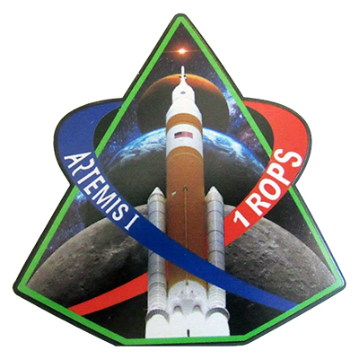 |
Robert Pearlman
Editor Posts: 54299
From: Houston, TX
Registered: Nov 1999
|
posted 03-25-2025 01:52 PM
It appears that NASA has had made special Artemis I lapel pins for presentation to exceptional members of the mission's support team.It may be made with flown metal, but it isn't clear. 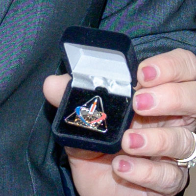 |