|
Author
|
Topic: ISS Expedition 36 insignia
|
MSS
Member Posts: 633
From: Poland
Registered: May 2003
|
 posted 09-15-2011 01:34 PM
  
ISS Expedition 36 mission patchThe International Space Station's (ISS) Expedition 36 begins with the scheduled undocking of Soyuz TMA-07M in May 2013. Three new crew members will arrive shortly thereafter on Soyuz TMA-09M. 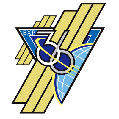
Credit: NASAExpedition 36 will be commanded by Roscosmos cosmonaut Pavel Vinogradov. His crewmates, all flight engineers include: cosmonauts Alexander Misurkin and Maxim Suraev Fyodor Yurchikhin, NASA astronauts Christopher Cassidy and Karen Nyberg, and European Space Agency (ESA) astronaut Luca Parmitano. The ISS Expedition 36 insignia was designed by Blake Dumesnil. 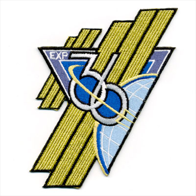
Source: AB Emblem/Spaceflight Now |
Bill Hunt
Member Posts: 399
From: Irvine, CA
Registered: Oct 2002
|
 posted 09-15-2011 05:48 PM
   
LOVE IT! Great design! |
GoesTo11
Member Posts: 1309
From: Denver, CO
Registered: Jun 2004
|
 posted 09-15-2011 07:26 PM
   
I love it too. I tend to be a traditionalist about these things, but every once in a while a bold departure really works. This one does. (And yes, it did take me a minute to realize that the gold bars are intended to represent the ISS solar arrays.)Does it also remind anyone else of the "old school" Soviet-era emblems that tended more toward the abstract and evocative than did American patches? |
carl walker
Member Posts: 360
From: Netherlands
Registered: Feb 2006
|
 posted 09-16-2011 04:46 AM
  
I think it's very Art Deco... Nice. |
Robert Pearlman
Editor Posts: 42984
From: Houston, TX
Registered: Nov 1999
|
 posted 09-16-2011 12:31 PM
   
The Expedition 36 insignia approved artwork has been added to the original post. |
spaceman
Member Posts: 1104
From: Walsall, West Midlands, UK
Registered: Dec 2002
|
 posted 09-16-2011 06:07 PM
   
Nice design sort of a retro Russian space patch/pin look. We seem to know too far in advance of the mission these days. No doubt the Malaysian network will have these on eBay, like yesterday. |
edorr
Member Posts: 64
From: Chelmsford, MA
Registered: Oct 2000
|
 posted 09-16-2011 06:13 PM
  
Sweet!! That's the most original design since... ever, I think! |
edorr
Member Posts: 64
From: Chelmsford, MA
Registered: Oct 2000
|
 posted 09-16-2011 06:23 PM
  
So Blake Dumesnil also was the winner for the Space Shuttle Program Commemorative patch design contest, another really original design that I liked a whole lot. What a talented guy! |
IconDesign29
Member Posts: 48
From: Houston, Texas
Registered: Apr 2011
|
 posted 09-19-2011 02:43 PM
  
I want to thank you all very much for the kind words about the Expedition 36 design! It is always an honor when a design is embraced by not only the crew members but also by the collectors, especially given that this is a more unique design.I greatly appreciate the support everyone! — Blake |
GoesTo11
Member Posts: 1309
From: Denver, CO
Registered: Jun 2004
|
 posted 09-19-2011 02:46 PM
   
This patch gets more awesome every time I look at it.  Great job, Blake. Great job, Blake. |
IconDesign29
Member Posts: 48
From: Houston, Texas
Registered: Apr 2011
|
 posted 09-19-2011 03:20 PM
  
I'm really thrilled to hear that! Even as long as I've been looking at it, I still haven't grown tired of it.I look forward to getting one of the patches in hand! |
NavySpaceFan
Member Posts: 655
From: Norfolk, VA
Registered: May 2007
|
 posted 09-20-2011 06:46 AM
   
Blake, I love the early Space Age/Mad Men era look of this patch. Well done! |
IconDesign29
Member Posts: 48
From: Houston, Texas
Registered: Apr 2011
|
 posted 09-20-2011 08:31 AM
  
Thanks very much! I have always found the early Space Age/Tomorrowland-era design work to be beautifully simplistic and very effective. I thought this styling might be a fresh approach to showcasing the ISS and placed focus on the iconography of the solar arrays. |
johntosullivan
Member Posts: 162
From: Cork, Cork, Ireland
Registered: Oct 2005
|
 posted 09-20-2011 08:37 AM
   
Love it! What's the significance of the trident? |
IconDesign29
Member Posts: 48
From: Houston, Texas
Registered: Apr 2011
|
 posted 09-20-2011 09:06 AM
  
One of the Expedition 36 crew members, Chris Cassidy, was a Navy SEAL so we thought it was a nice homage to his background. However in addition to that, the trident, as designated by the Navy, also symbolizes the sea, air, and land, all of which make up the earth from where the trident originates in the design. |
NavySpaceFan
Member Posts: 655
From: Norfolk, VA
Registered: May 2007
|
 posted 09-20-2011 09:42 AM
   
Another bit of info re: the trident is that it is part of both the Command at Sea and Command Ashore pins worn by Commanding Officers during their command tours. |
KAPTEC
Member Posts: 578
From: Madrid, Spain
Registered: Oct 2005
|
 posted 09-20-2011 10:43 AM
   
Congratulations Blake: really a well done job. I like it too much.  |
johntosullivan
Member Posts: 162
From: Cork, Cork, Ireland
Registered: Oct 2005
|
 posted 09-20-2011 10:56 AM
   
quote:
Originally posted by IconDesign29:
However in addition to that, the trident, as designated by the Navy, also symbolizes the sea, air, and land, all of which make up the earth from where the trident originates in the design.
The command at sea one, looks like an anchor instead of a trident. |
NavySpaceFan
Member Posts: 655
From: Norfolk, VA
Registered: May 2007
|
 posted 09-20-2011 11:45 AM
   
quote:
Originally posted by johntosullivan:
The command at sea one, looks like an anchor instead of a trident.
Actually, it's a star superimposed on a trident. |
IconDesign29
Member Posts: 48
From: Houston, Texas
Registered: Apr 2011
|
 posted 09-20-2011 01:29 PM
  
quote:
Originally posted by KAPTEC:
Congratulations Blake: really a well done job. I like it too much.
Thank you, Jorge! After all of the excellent designs you've created yourself, that's a much appreciated compliment! |
lucspace
Member Posts: 403
From: Hilversum, The Netherlands
Registered: Oct 2003
|
 posted 09-20-2011 03:54 PM
   
I can only add my admiration for this design! It is the most innovative and daring concept I have seen in a long time, and I love the Art Deco influence. Sincerely hope Blake gets to design more missions! |
IconDesign29
Member Posts: 48
From: Houston, Texas
Registered: Apr 2011
|
 posted 09-20-2011 05:14 PM
  
Thanks Luc! I think the word "daring" is a great way to describe this design. I'm really glad that it paid off to go outside the box for a change.Thank you again for kind words! |
johntosullivan
Member Posts: 162
From: Cork, Cork, Ireland
Registered: Oct 2005
|
 posted 09-20-2011 05:50 PM
   
quote:
Originally posted by NavySpaceFan:
Actually, it's a star superimposed on a trident.
I think you'll find it's a star superimposed on an anchor. The trident is for command ashore. Command at Sea Pin — Established in 1960 to recognize the responsibilities placed on those officers of the Navy who are in command, or who have successfully commanded, ships and aircraft squadrons of the fleet. The component parts, a commission pennant, an anchor, and the line star, were determined to be ideally suited for a design which would be symbolic in the ready identification of those officers who have attained the highly coveted and responsible title of Commanding Officer of our commissioned units at sea. |
NavySpaceFan
Member Posts: 655
From: Norfolk, VA
Registered: May 2007
|
 posted 09-20-2011 06:48 PM
   
quote:
Originally posted by johntosullivan:
I think you'll find it's a star superimposed on an anchor. The trident is for command ashore.
Well crap, you'd think 20 years in the Navy I'd know that. I stand corrected sir.
|
KSCartist
Member Posts: 2896
From: Titusville, FL USA
Registered: Feb 2005
|
 posted 09-22-2011 09:02 AM
   
I had the pleasure of congratulating Blake a few weeks back getting a preview of the artwork. The guy is simply an amazing artist. I join Jorge and Luc in hoping to see him design many more crew patches. Enjoy the feedback Blake - you really created something outstanding! |
IconDesign29
Member Posts: 48
From: Houston, Texas
Registered: Apr 2011
|
 posted 09-22-2011 11:32 AM
  
Needless to say, I would continue to consider it a great honor and privilege to design future mission patches so I do hope the opportunity arises again.The fact of the matter is that I am very humbled to follow in Tim, Jorge, Luc, and Sean's and many others' footsteps. I have grown up with each of your designs over the years and continue to respect and be inspired by what you guys have created! I always wondered who had such a cool job creating the mission patches so you really don't know what it means to be in your company. I really thank you for showing your appreciation for what little work I've done! |
p51
Member Posts: 1642
From: Olympia, WA
Registered: Sep 2011
|
 posted 09-22-2011 08:17 PM
   
I love this design! This is the kind of thing that sets this forum well apart from most other enthusiast sites in my opinion. We have people who design these patches posting about their work. As a part-time artist (really illustrator, haven't done insignia work in a long time and never anything for NASA), I love reading about the thought process that goes into these. I'd always been curious about the people who design these mission patches and how the process works. |
Skyforce1
Member Posts: 200
From: Vineland NJ, USA
Registered: Aug 2009
|
 posted 09-24-2011 12:20 AM
   
Looking at Expedition 36's patch and it's a great patch! Very cool looking patch and I like the different shape of it. |
Bill Hunt
Member Posts: 399
From: Irvine, CA
Registered: Oct 2002
|
 posted 09-24-2011 03:41 PM
   
I've got it in my hand, and I can't tell you how much I love it! I think the only thing that might really have added to it would be a hint of metallic thread, just as an accent - perhaps silver in the two white lines framing the upsidedown triangle, or maybe a touch of gold in the solar arrays. Regardless, this is as bold a patch design as I've seen in a long time. Very, very cool. My hats off, Blake! |
snf13
Member Posts: 74
From: Houston
Registered: May 2004
|
 posted 09-30-2011 02:59 PM
   
Wow! Just dynamite! Well done, Blake! |
East-Frisian
Member Posts: 586
From: Germany
Registered: Apr 2005
|
 posted 10-01-2011 03:03 AM
  
Yes indeed, it is so much different to the others. I like it. |
Robert Pearlman
Editor Posts: 42984
From: Houston, TX
Registered: Nov 1999
|
 posted 10-11-2012 03:37 PM
   
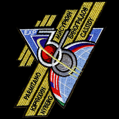
The Expedition 36 patch has undergone some design changes since first revealed in September 2011.
Source: AB Emblem |
GoesTo11
Member Posts: 1309
From: Denver, CO
Registered: Jun 2004
|
 posted 10-11-2012 03:58 PM
   
Well. That's...unfortunate. |
J Blackburn
Member Posts: 224
From: Riner, Virginia USA
Registered: Sep 2011
|
 posted 10-11-2012 04:33 PM
   
I knew this was coming and was curious what the new additions would look like. I like it, especially the crew member names. |
GoesTo11
Member Posts: 1309
From: Denver, CO
Registered: Jun 2004
|
 posted 10-11-2012 06:05 PM
   
I thought the original was unique in a very attractive way...now, not so much. I guess I'm OK with the crew names and flag bands...It's their patch not ours, etc etc.But what kills it aesthetically for me are the Mars/Moon in the "36." That big red orb in the center of what was such a cool, elegant design. Gah. |
pargoo
Member Posts: 67
From: Melbourne, Victoria, Australia
Registered: May 2005
|
 posted 10-11-2012 06:22 PM
   
I think this one looks *much* better, with the addition of a bit of red and a hint of green. |
KSCartist
Member Posts: 2896
From: Titusville, FL USA
Registered: Feb 2005
|
 posted 10-11-2012 07:33 PM
   
Bottom line is the changes were requested by the crew and done by the original artist. I think Blake did an outstanding job in trying to maintain the unique-ness of his original design and satisfy the requests of the crew. |
benguttery
Member Posts: 547
From: Fort Worth, TX, USA
Registered: Feb 2005
|
 posted 10-12-2012 08:26 AM
   
In college, I worked with a pilot (who may still be in prison) who told me aviation is about 90% show business and about 10% hard work. The sedate nature of the original patch wasn't enough to stir anyone. The new patch is more attention-getting because as another friend said, "No bucks, no Buck Rogers." |
QuiGon Grin
Member Posts: 52
From: Rutherford, NJ 07070
Registered: Apr 2010
|
 posted 10-15-2012 08:08 PM
  
Ugh! As with many things in life I think the phrase "Keep it simple" should have applied here. What to me was an elegant and different design has now become a cluttered overly designed mess.Oh well different strokes for different folks. |
pargoo
Member Posts: 67
From: Melbourne, Victoria, Australia
Registered: May 2005
|
 posted 10-16-2012 07:21 PM
   
Any idea how long we'll have to wait until the artwork appears in hi-res? |



 Great job, Blake.
