|
Author
|
Topic: ISS Expedition 31 insignia
|
hoorenz
Member Posts: 1031
From: The Netherlands
Registered: Jan 2003
|
 posted 08-15-2011 08:26 AM
   
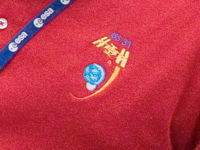
Not much, but first glimpse of ISS Expedition 31 patch. I can already tell you that it was designed by Luc van den Abeelen, with input from the crew. Another clue here: The simplified shirt art.  |
Robert Pearlman
Editor Posts: 42984
From: Houston, TX
Registered: Nov 1999
|
 posted 08-15-2011 08:30 AM
   
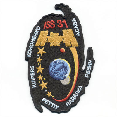
ISS Expedition 31 mission patchThe International Space Station's (ISS) Expedition 31 begins with the scheduled undocking of Soyuz TMA-22 in March 2012. Three new crew members will arrive shortly thereafter on Soyuz TMA-04M. 
Source: NASAExpedition 31 will be commanded by Roscosmos cosmonaut Oleg Kononenko. His crewmates, all flight engineers, include: cosmonauts Gennady Padalka and Sergei Revin, NASA astronauts Don Pettit and Joe Acaba, and ESA astronaut André Kuipers. The ISS Expedition 31 insignia was designed by artist Luc van den Abeelen. |
KSCartist
Member Posts: 2896
From: Titusville, FL USA
Registered: Feb 2005
|
 posted 08-15-2011 07:48 PM
   
Both the Expedition 31 and the Soyuz TMA-03M patches are outstanding. Super Job Luc! |
benguttery
Member Posts: 547
From: Fort Worth, TX, USA
Registered: Feb 2005
|
 posted 08-16-2011 07:51 AM
   
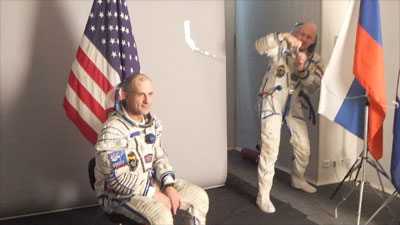
Did anyone else do a double-take and think Tom Stafford while looking at the pic? |
KAPTEC
Member Posts: 578
From: Madrid, Spain
Registered: Oct 2005
|
 posted 08-16-2011 08:27 AM
   
Well done Luc! Congratulations. |
lm5eagle
Member Posts: 429
From:
Registered: Jul 2007
|
 posted 08-16-2011 09:48 AM
   
Great patch, Luc. Look forward to getting one from spacepatches.nl in due course?! |
hoorenz
Member Posts: 1031
From: The Netherlands
Registered: Jan 2003
|
 posted 08-16-2011 10:09 AM
   
quote:
Originally posted by lm5eagle:
Look forward to getting one from spacepatches.nl in due course?!
Although Expedition-31 has a Russian commander, Luc worked directly with the crew and we were perfectly able to prepare the final artwork ourselves, we had to follow the "official" American route. The art had to be submitted to NASA-JSC, who changed a thing or two and placed the order with AB Emblem. So, that is where you will be able to get the official NASA-approved version of the patch. |
MSS
Member Posts: 633
From: Poland
Registered: May 2003
|
 posted 08-23-2011 12:32 PM
  
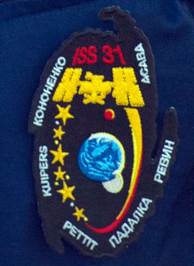
Here is the patch photo from ESA photogallery: ------------------
Maciej
Astronauts, Cosmonauts & their flights |
hoorenz
Member Posts: 1031
From: The Netherlands
Registered: Jan 2003
|
 posted 08-23-2011 03:06 PM
   
It is a prototype of the AB Emblem patch. Not that the final version changed much: the only difference is that the names of Padalka and Revin on this prototype are in a larger font than the other four names, which had to be corrected. |
Tom
Member Posts: 1597
From: New York
Registered: Nov 2000
|
 posted 08-23-2011 03:14 PM
   
Very different design. Looks similar to the symbol used for a hurricane...very nice! |
KAPTEC
Member Posts: 578
From: Madrid, Spain
Registered: Oct 2005
|
 posted 08-23-2011 03:48 PM
   
I think it represents a galaxy... Isn't it Erik? Very nice! |
hoorenz
Member Posts: 1031
From: The Netherlands
Registered: Jan 2003
|
 posted 08-23-2011 04:02 PM
   
Milky Way, yes. Design should be rotated slightly (see simplified shirt embroidery). |
dogcrew5369
Member Posts: 750
From: Statesville, NC
Registered: Mar 2009
|
 posted 08-23-2011 07:04 PM
   
So I guess we're still going back to the moon and Mars? Realistically there should be an asteroid in the patch... at least we're planning on going there some day. quote:
Originally posted by Tom:
Looks similar to the symbol used for a hurricane...
I believe it would have to be a hurricane in the southern hemisphere. The coreolis effect spins hurricanes that affect the US in the counter clockwise direction. Looks to me that the patch designs spins in the clockwise.  |
Robert Pearlman
Editor Posts: 42984
From: Houston, TX
Registered: Nov 1999
|
 posted 08-23-2011 07:16 PM
   
quote:
Originally posted by dogcrew5369:
...at least we're planning on going there some day.
This shouldn't become a thread to debate current U.S. policy, but as outlined by NASA, an asteroid is only the first of deep space targets being planned, with the moon and Mars to follow. |
hoorenz
Member Posts: 1031
From: The Netherlands
Registered: Jan 2003
|
 posted 08-24-2011 02:24 AM
   
Allow me a final remark on the subject: it is great that NASA wants to fly to an asteroid, but this is a patch designed to the wishes of an international crew, not only consisting of two Americans, but also three Russians (including the commander) and a European. |
Skyforce1
Member Posts: 200
From: Vineland NJ, USA
Registered: Aug 2009
|
 posted 08-24-2011 04:20 AM
   
Different kind of shape for a patch, rather unique, quirky but still a tad boring. Nice colors though! |
Mike Z
Member Posts: 451
From: Ellicott City, Maryland
Registered: Dec 2005
|
 posted 08-24-2011 07:23 PM
   
I like the shape. It's different and that's good. It looks like there was a lot of thought and imagination put into designing this patch. It looks great!! Congratulations on NASA approving it. |
KSCartist
Member Posts: 2896
From: Titusville, FL USA
Registered: Feb 2005
|
 posted 08-24-2011 09:02 PM
   
The original artwork is even better than the patch. |
KAPTEC
Member Posts: 578
From: Madrid, Spain
Registered: Oct 2005
|
 posted 08-25-2011 09:47 AM
   
You're right Tim: very much better... |
dogcrew5369
Member Posts: 750
From: Statesville, NC
Registered: Mar 2009
|
 posted 08-25-2011 03:57 PM
   
Did I mention I like the patch. |
johntosullivan
Member Posts: 162
From: Cork, Cork, Ireland
Registered: Oct 2005
|
 posted 09-07-2011 08:31 AM
   
I'm sorry but I don't like it. Maybe with a border to define the edge, it might be better.Galaxies are normally displayed as white or light colours. Maybe that should have been the background colour. It looks a bit blobby. |
dogcrew5369
Member Posts: 750
From: Statesville, NC
Registered: Mar 2009
|
 posted 09-08-2011 04:37 AM
   
I don't know why, but it made me think of the cloud entity on Star Trek The Motion Picture. My earlier comment about liking it was a little tongue-in-cheek to get away from my earlier apparent political statement. Being that the "galaxy" is so dark maybe it's dark energy  |
NavySpaceFan
Member Posts: 655
From: Norfolk, VA
Registered: May 2007
|
 posted 09-08-2011 06:50 AM
   
Nice design, but the unusual shape must make it a bear to sew on to clothing. |
GoesTo11
Member Posts: 1309
From: Denver, CO
Registered: Jun 2004
|
 posted 09-08-2011 06:56 PM
   
quote:
Originally posted by johntosullivan:
I'm sorry but I don't like it. Maybe with a border to define the edge, it might be better. It looks a bit blobby.
I agree. Like the concept; not crazy about the execution. |
Robert Pearlman
Editor Posts: 42984
From: Houston, TX
Registered: Nov 1999
|
 posted 09-13-2011 07:53 AM
   
The artwork for the ISS Expedition 31 patch has been replaced above with the official NASA version (in both low and high resolution). For reference, here is the art that was earlier posted, as released by ESA. 
Source: ESA/EAC |
Jacques van Oene
Member Posts: 861
From: Houten, The Netherlands
Registered: Oct 2001
|
 posted 09-13-2011 01:16 PM
  
ISS is in this NASA version orange instead of yellow, and the names are different also... I'm sure Luc made ISS yellow... So like with Expedition'30, NASA has chanced the work of the artist, very very strange.Can anybody at NASA comment on this? |
Robert Pearlman
Editor Posts: 42984
From: Houston, TX
Registered: Nov 1999
|
 posted 09-13-2011 01:39 PM
   
I will be interviewing Don Pettit next Tuesday (Sept. 20) and will ask him about the patch. |
hoorenz
Member Posts: 1031
From: The Netherlands
Registered: Jan 2003
|
 posted 09-13-2011 02:41 PM
   
To give you a better idea of what we are talking about, a high resolution image of Luc's original artwork can be found here. It is the version that was designed together with the crew and was submitted to NASA, but now moved down in this thread as being "not official". One of the first things that stands out when you compare the two versions, is indeed the orange ISS. Actually, this is something NASA changed just three weeks ago. In their initial re-creation of the design, ISS was still yellow with an orange outline. It looks like NASA has changed their "official" art in retrospective to match the embroidery. There is more, including a couple of issues with the fonts. Some of these were corrected at AB Emblem, but were not updated in the NASA art. Here is an example of how much the original artwork "improved" in the hands of NASA:  |
lucspace
Member Posts: 403
From: Hilversum, The Netherlands
Registered: Oct 2003
|
 posted 09-14-2011 03:55 AM
   
I'm surprised that JSC graphics department can change a crew — and management — approved patch design. A real pity, as I feel the NASA-version is less interesting than my original design. I did design it with an effect in mind, and that is now gone, resulting in quite a bland version.Anyway, before more 'editing' takes place, this is the description of the patch I submitted for NASA use: Expedition 31 patch descriptionThe shape of the patch is a stylized representation of an oblique view of our galaxy. The background is black in colour, to represent the expanse of deep space. It also symbolizes the research into dark matter, one of the scientific objectives of Expedition 31. At the heart of the patch are the Earth, the Moon and Mars, our home in the galaxy and the focus of current and future exploration. The completed complex of the International Space Station features at the top of half an orbit around the Earth, for the half-year expedition aboard the station. Brightly coloured, it signals the pride of the accomplishment of building this unique international facility. A collection of stars completes the orbit. The three large stars are for the Expedition 31 crew; the smaller ones represent the Expedition 30 crew that took up residence aboard the ISS before them. A number of small stars, represented by dots, symbolize the visiting vehicles that will dock with the orbital complex during
this expedition. Thin crescents along the horizons of Earth and moon, and along the orbit, depict the number of this ISS expedition: 31. |
Robert Pearlman
Editor Posts: 42984
From: Houston, TX
Registered: Nov 1999
|
 posted 09-14-2011 08:50 AM
   
quote:
Originally posted by lucspace:
I'm surprised that JSC graphics department can change a crew — and management — approved patch design.
It was apparently the Astronaut Office, not the graphics department, that made the changes after going through the patch sample process with AB Emblem.Here is the official description of the patch, as approved by the Astronaut Office: Expedition 31 patch description Thin crescents along the horizons of the Earth and Moon depict International Space Station (ISS) Expedition 31. The shape of the patch represents a view of our galaxy. The black background symbolizes the research into dark matter, one of the scientific objectives of Expedition 31. At the heart of the patch are the Earth, Moon, Mars, and asteroids, the focus of current and future exploration. The ISS is shown in an orbit around the Earth, with a collection of stars for the Expedition 30 and 31 crews. The small stars symbolize the visiting vehicles that will dock with the complex during this expedition. |
KAPTEC
Member Posts: 578
From: Madrid, Spain
Registered: Oct 2005
|
 posted 09-14-2011 09:37 AM
   
It is quite shameful... |
Robert Pearlman
Editor Posts: 42984
From: Houston, TX
Registered: Nov 1999
|
 posted 09-14-2011 09:40 AM
   
What is shameful of making changes to a design after seeing the original art embroidered? |
KAPTEC
Member Posts: 578
From: Madrid, Spain
Registered: Oct 2005
|
 posted 09-14-2011 11:35 AM
   
The JSC graphics department changes of an artist design. |
Robert Pearlman
Editor Posts: 42984
From: Houston, TX
Registered: Nov 1999
|
 posted 09-14-2011 11:47 AM
   
Again, the graphics department was only following the instructions of the Astronaut Office.Even though astronauts may choose to work with outside volunteer artists, it does not change the fact that it is the space agency that is ultimately responsible for the final insignia. |
hoorenz
Member Posts: 1031
From: The Netherlands
Registered: Jan 2003
|
 posted 09-14-2011 12:00 PM
   
'The' space agency? |
Robert Pearlman
Editor Posts: 42984
From: Houston, TX
Registered: Nov 1999
|
 posted 09-14-2011 12:09 PM
   
I purposely didn't write NASA, but rather the space agency responsible for the given design. Roscosmos, NASA, ESA, CSA and JAXA are each responsible for their own designs. NASA has managed the ISS expeditions designs from the start of the program. |
Robert Pearlman
Editor Posts: 42984
From: Houston, TX
Registered: Nov 1999
|
 posted 09-15-2011 01:15 PM
   
AB Emblem's ISS Expedition 31 embroidered patch: 
Source: Spaceflight Now |
hoorenz
Member Posts: 1031
From: The Netherlands
Registered: Jan 2003
|
 posted 09-15-2011 01:25 PM
   
As you can see, the font size of Padalka and Revin was repaired by AB Emblem in this final version (compared to the prototype that showed up earlier in this thread). They are still too large in the NASA graphic, however. A new feature on the little white sticker with the product number on the back of these AB Emblem patches (not visible here) is the addition of the line 'made in USA'. All subsequent patches produced to date (Exp 32, 36 and, most recently, 35) have this line as well. |
Henry Heatherbank
Member Posts: 244
From: Adelaide, South Australia
Registered: Apr 2005
|
 posted 09-16-2011 05:35 AM
  
Sorry, don't like it. |
Robert Pearlman
Editor Posts: 42984
From: Houston, TX
Registered: Nov 1999
|
 posted 09-20-2011 05:58 PM
   
quote:
Originally posted by Robert Pearlman:
I will be interviewing Don Pettit next Tuesday (Sept. 20) and will ask him about the patch.
I didn't have a chance to ask Pettit about the emblem, but did discuss it with Andre Kuipers. In addition to having some very nice things to say about Luc van den Abeelen and his designs, Kuipers said that while he was aware there were European and U.S. versions of the patch, he thought that both looked very good. His only specific comment was about an initial mistake made in the embroidery of the simplified, or crew version of the emblem, as pictured on the red shirt above. As noted in the emblem's description, crescents along the horizons of the Earth and Moon, and along the orbit, form the number '31' — and that was accidentally left out of the simplified logo. |
