|
Author
|
Topic: ISS Expedition 30 insignia
|
Robert Pearlman
Editor Posts: 42984
From: Houston, TX
Registered: Nov 1999
|
 posted 04-26-2011 09:06 AM
   
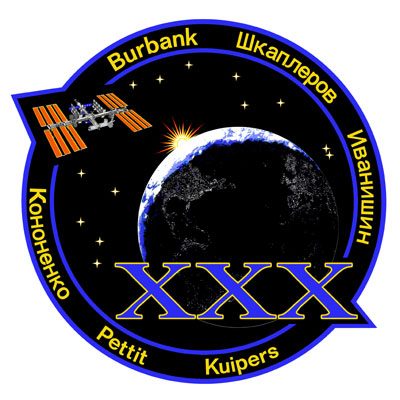
ISS Expedition 30 insignia Expedition 30 marks the International Space Station's (ISS) 30th long duration mission. Expedition 30 begins with Soyuz TMA-02M undocking in November 2011. Three new crew members arrive shortly thereafter with Soyuz TMA-03M. - NASA astronauts Dan Burbank, commander; and Don Pettit
- Roscosmos cosmonauts Anton Shkaplerov, Anatoly Ivanishin and Oleg Kononenko
- European Space Agency (ESA) astronaut André Kuipers
Expedition 30 mission patch The International Space Station program is completing the transition from assembly to full utilization as humankind celebrates the golden anniversary of human space exploration. In recognition of these milestones and especially of the contributions of those whose dedication and ingenuity make spaceflight possible, a fully assembled ISS is depicted rising above a sunlit earth limb. Eastward of the sunlit limb, the distinctive portrayal of the earth's surface illuminated by nighttime city lights is a reminder of mankind's presence on the planet, most readily apparent from space only by night, and commemorates how humans have transcended their earthly bonds throughout the preceding 50 years of space exploration. The ISS, a unique space-based outpost for research in biological, physical, space and earth sciences, is an impressive testament to the tremendous teamwork of the engineers, scientists and technicians from 14 countries and five national space agencies. The six crewmembers of Expedition 30, like those who have gone before them, are honored to represent their countries and the international ISS team in conducting research aboard the ISS and adding to the body of knowledge that will enable the world's space faring countries to more safely and more productively live, work and explore outer space, paving the way for future missions beyond low earth orbit, and inspiring young people to join in this great adventure.
The patch was designed by Tim Gagnon and Jorge Cartes working with Expedition 30 commander Dan Burbank. |
NavySpaceFan
Member Posts: 655
From: Norfolk, VA
Registered: May 2007
|
 posted 04-26-2011 09:43 AM
   
Another winner! The blue and gold color scheme does not surprise me since CAPT Burbank wears wings of gold. |
hoorenz
Member Posts: 1031
From: The Netherlands
Registered: Jan 2003
|
 posted 04-26-2011 10:57 AM
   
Nice work Tim and Jorge! |
LM-12
Member Posts: 3207
From: Ontario, Canada
Registered: Oct 2010
|
 posted 04-26-2011 11:49 AM
  
The ISS-30 patch is very cool. The Earth looks real compared to the ISS-35 design. I guess ISS-30 will be the first post-Shuttle Expedition since all six crew members will launch after STS-135. |
ejectr
Member Posts: 1751
From: Killingly, CT
Registered: Mar 2002
|
 posted 04-26-2011 12:18 PM
   
Excellent patch. Really nice. |
Fezman92
Member Posts: 1031
From: New Jersey, USA
Registered: Mar 2010
|
 posted 04-26-2011 01:04 PM
   
Nice patch. |
Harald Kraenzel
Member Posts: 304
From: Dinslaken,Germany
Registered: Nov 2005
|
 posted 04-26-2011 04:34 PM
   
Great design Tim and Jorge. Like it very much!
|
Robert Pearlman
Editor Posts: 42984
From: Houston, TX
Registered: Nov 1999
|
 posted 04-26-2011 06:49 PM
   
The official patch description has been added above. |
Tom
Member Posts: 1597
From: New York
Registered: Nov 2000
|
 posted 04-26-2011 07:30 PM
   
Great job Tim and Jorge!Not many flight crew patches use "lower case" lettering... I believe only previous ones are STS-41G and STS-75. |
Mike Z
Member Posts: 451
From: Ellicott City, Maryland
Registered: Dec 2005
|
 posted 04-26-2011 07:41 PM
   
It's a really a beautiful patch that tells the story about ISS. Congratulations Tim and Jorge!! Well done!! |
Henry Heatherbank
Member Posts: 244
From: Adelaide, South Australia
Registered: Apr 2005
|
 posted 04-26-2011 08:57 PM
  
quote:
Originally posted by Tom:
I believe only previous ones are STS-41G and STS-75.
In Apollo, 12 and 14 also used lower case. |
heng44
Member Posts: 3386
From: Netherlands
Registered: Nov 2001
|
 posted 04-26-2011 11:54 PM
   
Another great one, guys! |
Henry Heatherbank
Member Posts: 244
From: Adelaide, South Australia
Registered: Apr 2005
|
 posted 04-27-2011 02:56 AM
  
There is certainly something very striking about the use of the roman numeral "X" on a patch, of course first used on Gemini X, designed (I think) by Young's wife.The use of the "X" on Apollo 10 was visually very striking - and in my opinion the best use of a roman numeral on any patch. The "XXX" for ISS-30 is fabulous. For mine however, I think this patch lacks a bit of colour and is a bit depressing. Could have been more uplifting if the sunrise were akin to ISS-35 released the other day. And use of lower case letters for crew names is - on this patch - a great touch. |
PowerCat
Member Posts: 193
From: Herington, KS, USA
Registered: Feb 2006
|
 posted 04-27-2011 05:04 AM
   
Absolutely awesome design. Love the features! Great job Tim and Jorge!! |
Ken Havekotte
Member Posts: 2913
From: Merritt Island, Florida, Brevard
Registered: Mar 2001
|
 posted 04-27-2011 06:54 AM
   
Nice artwork, Tim and Jorge, for ISS/Expedition 30. This is perhaps one of my favorite Expedition crew logo designs and I'll be looking forward to getting our NASA supply of decal stickers. I'll save a bunch for you both. Great work, guys, as usaual! |
sts205cdr
Member Posts: 649
From: Sacramento, CA
Registered: Jun 2001
|
 posted 04-27-2011 12:23 PM
   
GORGEOUS!!! |
heng44
Member Posts: 3386
From: Netherlands
Registered: Nov 2001
|
 posted 04-30-2011 03:01 AM
   
Also, it is good to see the name of our Dutch André Kuipers on a patch again! |
QuiGon Grin
Member Posts: 52
From: Rutherford, NJ 07070
Registered: Apr 2010
|
 posted 06-26-2011 08:16 PM
  
I love the continents outlined by “city” lights. A very unique and interesting artistic choice. Blue and gold? I’ll have to calibrate my screen as its looks purple and yellow to me, which would have been another interesting choice and unique choice.
Now for my typical question-the meaning of the thirteen stars and there arrangement? |
KAPTEC
Member Posts: 578
From: Madrid, Spain
Registered: Oct 2005
|
 posted 06-27-2011 07:48 AM
   
Daughters and sons of the crew... without a special order but the presence of a couple of them at the side: Our little sign. Have a look to older artworks...  |
Skyforce1
Member Posts: 200
From: Vineland NJ, USA
Registered: Aug 2009
|
 posted 07-08-2011 02:10 PM
   
Looking at the patch closeup and it's a winner! Absolutely gorgeous! Kudos to Tim and Jorge on another fine patch! |
hoorenz
Member Posts: 1031
From: The Netherlands
Registered: Jan 2003
|
 posted 09-09-2011 02:39 AM
   
Does anyone know why the name of Burbank is in a larger font? (Compare the 'r' and the 'u' in his name to that of Kuipers). Is it because he will be the Expedition commander? (Or is it just my imagination?) |
KSCartist
Member Posts: 2896
From: Titusville, FL USA
Registered: Feb 2005
|
 posted 09-09-2011 07:43 AM
   
I can say that when I placed the names on the patch, they were all the same size. But I can see what you mean. Dan's name does look bigger. |
Robert Pearlman
Editor Posts: 42984
From: Houston, TX
Registered: Nov 1999
|
 posted 09-09-2011 08:10 AM
   
Burbank is in a slightly larger font to the other names. I suspect it may have been done to balance the layout between his name and Shkaplerov. |
KAPTEC
Member Posts: 578
From: Madrid, Spain
Registered: Oct 2005
|
 posted 09-09-2011 06:36 PM
   
I'm sorry but ALL the names were in the same size in our artwork. We NEVER made any name bigger than other. And I know very well of what I am talking... |
Jacques van Oene
Member Posts: 861
From: Houten, The Netherlands
Registered: Oct 2001
|
 posted 09-10-2011 02:03 AM
  
So how does it come that the name is bigger then?
|
KAPTEC
Member Posts: 578
From: Madrid, Spain
Registered: Oct 2005
|
 posted 09-10-2011 02:47 AM
   
Jacques, ask to the Houston graphic guys... I made personally the lower case letters. And all the names were in the same size in two fonts: one for the latin names and one for the cyrillic's. But in the same size. |
Jacques van Oene
Member Posts: 861
From: Houten, The Netherlands
Registered: Oct 2001
|
 posted 09-10-2011 03:04 AM
  
So JSC messed up your artwork? That is strange to chance things that were made by an artist... Something like, hey I do not like this in a Rembrandt painting let me change this, might look better! Very strange... Sorry to hear this Jorge. |
hoorenz
Member Posts: 1031
From: The Netherlands
Registered: Jan 2003
|
 posted 09-10-2011 04:44 AM
   
Jorge is better than Rembrandt!  Honestly, it is a pretty small mistake. I was not even sure I saw it right, so it would have probably gone unnoticed. Honestly, it is a pretty small mistake. I was not even sure I saw it right, so it would have probably gone unnoticed. Looking closer at it, I think I have found a possible explanation. By redrawing the letters, they must have started at Burbank's name, which did fit in nicely with the chosen font size. When they moved to the next name (probably Shkaplerov) they were suddenly confronted with the cyrillic 'p' in his name, a so called 'descending' letter, which has a portion below the baseline. This would not have fit, so they chose a smaller font and continued using it. This way, Kuipers' name also did fit in. Then, they probably simply forgot to change Burbank as well. Why NASA changes the art at all, is a mystery to me. It can not be the quality of the original art. Maybe the NASA contractor gets hours assigned to draw logo's and simply does it to have a job. Or, maybe, it is because of copyright issues. By redrawing and slightly changing the logo, the original becomes a draft, to which maybe other rules apply, while the final product is completely under NASA control. I have really no idea. |
KAPTEC
Member Posts: 578
From: Madrid, Spain
Registered: Oct 2005
|
 posted 09-10-2011 08:47 AM
   
I do not know which was the matter (and thank you so much, Erik: remember me that I due you some beers to drink together sometime in somewhere when finally we could met each other).When drawing the names, I take special care in fit the Capital letters just between both blue lines, leaving space enough in their base for Russian letters or Kuiper's & Skaplerov's "p"... Really I offered them the vector version of the patch but they never answered me... If you go to the official NASA page of the emblem, it is not a vector drawing this time. |
hoorenz
Member Posts: 1031
From: The Netherlands
Registered: Jan 2003
|
 posted 09-10-2011 09:46 AM
   
Same here with Expedition-31. We delivered picture perfect, super sharp vector art (the image EAC released in a low resolution the other day). NASA did not use it. Instead, they chose to completely draw the logo again. Among the mistakes / changes they introduced, were again some that involved the fonts. Maybe these have been repaired in their - yet to be released - final version, but one that stands out (Pettit's name not being on a curve) ended up in the final version of the AB Emblem patch. Totally unnecessary, because good art was available. |
Robert Pearlman
Editor Posts: 42984
From: Houston, TX
Registered: Nov 1999
|
 posted 09-10-2011 09:58 AM
   
Speculating, but the problem (if you can call it that) might be that NASA and its international partners need more than just vector art. I know from seeing past graphic files, Pantone color assignments are required (as may be CMYK color palette versions, rather than RGB). Color-separated files (or layers) may also be needed. |
KAPTEC
Member Posts: 578
From: Madrid, Spain
Registered: Oct 2005
|
 posted 09-10-2011 11:06 AM
   
Bob, that was that I offered them: a separated layer of each part of the draft... And this is what I have here kept in my PC. What more do they need?Anyway it has been a minor problem, I think, and we do not want to give it more importance that the one it has. |
hoorenz
Member Posts: 1031
From: The Netherlands
Registered: Jan 2003
|
 posted 09-10-2011 01:12 PM
   
I agree Jorge. Rockets do not fail because of patches with wrong fonts or changed colors. Still, it is disappointing to see a 'draft' version that is better than the final product, especially when it also affects the quality of the patches for the crew... Enough for now! |
KAPTEC
Member Posts: 578
From: Madrid, Spain
Registered: Oct 2005
|
 posted 09-10-2011 01:13 PM
   
I love this hobby... and your support and friendship. Thank you Erik. |
hoorenz
Member Posts: 1031
From: The Netherlands
Registered: Jan 2003
|
 posted 09-10-2011 01:59 PM
   
Yes, it is fun! |


