|
Author
|
Topic: Alan Bean's "John Young Leaps into History"
|
ArtUSA
Member Posts: 16
From: Cleveland, Ohio, USA
Registered: Nov 2009
|
 posted 04-28-2010 07:04 PM
   
The next Alan Bean release from Greenwich Workshop will be "John Young Leaps into History." The piece will be coming out the last week of June. It will be available on both paper and canvas.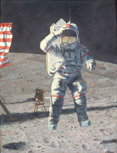 "You feel this way when you're finally on the Moon!" says artist and Apollo 11 astronaut Alan Bean. "It's the culmination of all you've studied and worked for since you were a little kid."John has jumped straight up about 3 feet or so. On Earth, this would have been impossible because John weighs 160 pounds and the suit and the backpack weigh 150 pounds, but on the Moon everything (including John) weighed only one-sixth as much. Someday there will be athletic contests on the Moon, maybe even Solar System Olympics and many astonishing records will be set." Apollo 16, April 16-27, 1972, was Young's fourth space flight but his first lunar exploration. Young was Spacecraft Commander accompanied by Astronauts Ken Mattingly and Charlie Duke. Young and Duke set up scientific equipment and explored the lunar highlands at Descartes in the Lunar Rover. Because it's being announced now, you can take advantage of the buy one, get one free "Great Art Upgrade" special that the Greenwich Workshop has announced for new releases.Both the canvas (sold out from the publisher) and paper editions are available from ArtUSA. You can select any of the pieces shown of equal value or less as a bonus with your purchase. Reserve your copy now and pay in June when the piece is released. |
Spacefest
Member Posts: 1168
From: Tucson, AZ
Registered: Jan 2009
|
posted 04-28-2010 09:19 PM
Ditto, at Astronaut CentralYou can get a free print (your choice) of equal or lesser value. BOGO! Email for details (order by June 20). Professional framing available. USA Shipping included.
|
randyc
Member Posts: 779
From: Chandler, AZ USA
Registered: May 2003
|
posted 07-01-2010 10:23 AM
After speaking with the dealer that I buy my Bean art from he explained that this giclee is a 'revised' version of the original. He softened the contrast between the brightly lit areas of the spacesuit and the shadowed areas, and the color of the lunar surface has been changed from predominantly grey to tan/brown (by the way, the image above is of the original painting and not the recently issued giclee, which is shown below). In my opinion, this version is not as good as the original. Personally I prefer the contrast of light and dark not only because it looks better but also because it's how the lighting really is on the lunar surface. Without air molecules to scatter the light, shadows are deep black, and whites are bright white. Alan takes 'artistic license' in his artwork by not portraying the actual lighting conditions - in all of his paintings the shadowed areas are 'lightly' shadowed and you can see the surface 'underneath' the shadow. If he's trying to convey what's it's really like to be on the lunar surface, including the disorientation effect of the unique lighting, he's not accomplishing that goal. Let the arrows fly! 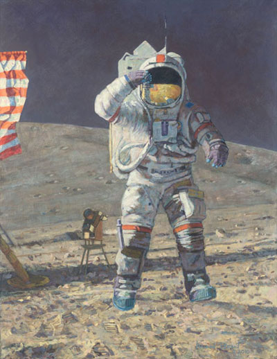 Just for the record - I didn't post this image, someone else did. It looks like the contrast of this image was 'tweaked' because the contrast and colors of the actual canvas version of this giclee are significantly more subtle than this image. Editor's note: The image was added for reference, copied from Greenwich Workshop's website. No changes were made to the image other than being made slightly smaller. Randy's note: O.K., so Greenwich 'tweaked' the photo (I never said, or implied, that it was Robert). Believe me, I'm looking right at the actual canvas giclee, and the contrast and details are not as good as either the original or the Greenwich photo. |
Spacefest
Member Posts: 1168
From: Tucson, AZ
Registered: Jan 2009
|
posted 07-01-2010 03:36 PM
Much ado... the color and contrast is BETTER than the promo pix. |
MarylandSpace
Member Posts: 1336
From:
Registered: Aug 2002
|
posted 07-01-2010 08:56 PM
It looks like a fun print to have on the wall. Is it signed by both Alan Bean and John Young?My all time favorite is The Hammer and the Feather. I can almost hear Dave Scott speaking before he demonstrates gravity. |
ArtUSA
Member Posts: 16
From: Cleveland, Ohio, USA
Registered: Nov 2009
|
posted 07-02-2010 07:08 AM
quote:
Originally posted by MarylandSpace:
It looks like a fun print to have on the wall. Is it signed by both Alan Bean and John Young?
"John Young Leaps into History" is hand-signed by Alan Bean. It is available as a Giclee on Paper and Canvas. |
divemaster
Member Posts: 1376
From: ridgefield, ct
Registered: May 2002
|
posted 07-02-2010 11:43 AM
Scott Usher - USHERSC@GreenwichWorkshop.com - is the president of Greenwich Workshop. He took the time to explain the entire thing to me and I think that he would welcome hearing from you about this print, either way. He's a very nice man who actually LISTENS to his clients. Rare in this day and age.
Vinny Grabowski - GRABOWSKI@GreenwichWorkshop.com - is the head of sales [and fellow dog lover] and was also a great help in explaining the process. He, too, is also VERY open to hearing your comments. I learned a lot in the last 48 hours.It's wonderful dealing with people who actually LISTEN to your concerns and comments. A tip o the beanie to both of them. |
Spacefest
Member Posts: 1168
From: Tucson, AZ
Registered: Jan 2009
|
posted 07-02-2010 01:35 PM
 |
divemaster
Member Posts: 1376
From: ridgefield, ct
Registered: May 2002
|
posted 07-02-2010 07:06 PM
Interesting.
Any photo that you look at online depends on the quality of the monitor that you're looking at and the resolution at which it was uploaded.
Before taking off for the holiday weekend, I looked through various web sites that carry the above painting and saw both the 1983 original and the 2010 update - and not one site that I looked at [at the time] mentioned that there was an updated print. Some in better resolution than others. Most have varying sizes. Some have watermarks, some don't. You had to really blow up the size of the print so you could actually read the copyright date to make sure which one you were looking at - and, with a lot of them - you almost had a screen full of pixels.
Now, in this thread, as of this moment, there are THREE photos of the same INCREDIBLY SPECTACULAR piece by Alan Bean - and, to my eyes, they all look different. Now, I'm currently in a place that just received the giclee print and I'm staring at it as I type. I'm also looking at the photo right above this message. The giclee print has more muted reds to my eyes then the photo above on the laptop that I'm also looking at right now.
So, I guess the lesson learned is that items might be updated if you're not paying attention and photos can and will appear differently on every computer screen. Your own eyes seeing the real deal gives you the ultimate answer.And, lastly, in my opinion, the changes that Alan did with the shadowing made it an entirely different, greatly improved piece - which I still can't believe is possible. And the flag in the visor REALLY pops out from the 1983 original that appears on Alan's personal gallery web site. I wish that I had 1% of his talent. What I would do to have that "art gene" in my blood. [sigh] And, as a totally unfair comparison, if you go to Wally Schirra's daughter's web site at suzanneschirra.com, she paints with such vivid colors that it's next to impossible to try to duplicate them online. Every time she comes out with a new painting, trying to reproduce it in all of its glory is next to impossible. But we're comparing apples and oranges here. I'm just talking about monitors, photo size and uploaded resolution. |
Spacefest
Member Posts: 1168
From: Tucson, AZ
Registered: Jan 2009
|
posted 07-02-2010 11:49 PM
At any rate, those who ordered the canvas will be pleased with the color and contrast. My photo is a scan of an actual canvas. the reds are bright, especially the helmet stripe.Tracy is right. Monitors make a difference. I'm on an iMac with a huge screen. The contrast and color saturation are amazing. Behind me is a Dell with a Sony monitor. On it, all three versions shown on this page look hopelessly pale and washed out. I'm not convinced that resolution (which is always 72 dpi on a monitor) matters as far as color, though, but you forgot another variable-the human eye. As an artist, I found that everyone experiences color differently. I see the stop lights as red, orange and blue. The sky is the deepest, richest blue 30 minutes after sunset. So
blue that I can feel it. I guess I'm just a blue guy. Some people see greens differently, some people have cataracts and don't know it. Some of them may have differing degrees of color blindness. Artist Robert McCall was one of those. Van Gogh saw yellows brighter than normal, because of the foxglove herb that he took for his epilepsy. His work shows it. Anyway the print is vibrant to me, but color and contrast is perceptual, as well as mechanical. YMMV. |
divemaster
Member Posts: 1376
From: ridgefield, ct
Registered: May 2002
|
posted 07-03-2010 07:07 AM
I guess that Kim is saying that you're only as good as your equipment. I'll skip the obvious joke.
But, yes, your own eyes are the best judge and, as he says, even THEY may fool you.
Red stripes on the suit are vivid on the one I'm looking at. The red on the visor flag really pops. Yet, the red on the flag to the left doesn't pop as much as the rest of the reds [in my eyes] on the print that I'm looking at, but is absolutely fine.
I also like the green on John's boots. Nice touch. Alan is the only artist I've ever seen who uses so many colors to depict black, white and gray. Amazing. |
Spacefest
Member Posts: 1168
From: Tucson, AZ
Registered: Jan 2009
|
posted 07-03-2010 03:20 PM
Upon re-reading Randy's post, he says the shadows should be blacker, because there is "no air to scatter the light." This is an erroneous statement often used by moon hoaxers. Why then can you see, for example Aldrin descending the LM ladder, in shadow, in great detail? Light doesn't need air to scatter. Bean isn't using artistic license there. |
randyc
Member Posts: 779
From: Chandler, AZ USA
Registered: May 2003
|
posted 07-03-2010 03:35 PM
Kim, Alan is absolutely using artistic license when he's painting shadows on the lunar surface. Read comments made by the astronauts who've walked on the moon, and those who have walked in space (yeah, I know Alan walked on the moon, but even he has to admit that when in the shadow of the LM he could not see the surface, certainly not as well as he portrays in his paintings). And look at the thousands of photos taken on the surface that show that the shadows are 'pitch black'. You can't see the surface 'underneath' the shadows. Alan uses quite a lot of 'artistic license' in his paintings. For example, look at his paintings of 'Eagle' descending to the surface and lifting off. The lighting is completely incorrect. It's dramatic, but wrong. And I've never seen photos of the lunar surface where the soil is pink, purple, yellow, etc. He's just emulating one of his favorite artists, Monet. The reason why Aldrin can be seen in the shadow of the LM is twofold: 1. The camera lens is wide open to capture as much light as possible (that's why the lunar surface is 'washed out' in the photo) and 2. Because he's above the surface (in other words, he's 3 dimensional and not flat on the surface) his suit is being illuminated by light reflecting off the surface that's not in the shadow. I suggest that anyone who would like to discuss the philosophy that Alan uses when he paints contact me off-line. My intent is not to criticize Alan or his paintings - Alan's a great guy. I'm simply addressing comments regarding the 'accuracy' of them (after all, they ARE documenting actual, historical events). Thanks. |
AJ
Member Posts: 511
From: Plattsburgh, NY, United States
Registered: Feb 2009
|
posted 07-03-2010 08:28 PM
Bear in mind he is an ARTIST and you know what artists do? They use artistic license.  That's part of what makes the paintings appealing to so many people. No, the moon might not be pink, but I still like his paintings. I think they capture a lot of the magic of Apollo. I also think that Capt. Bean is far beyond "emulating" Monet and to say otherwise does a talented artist a disservice. Impressionism was called that because of the style of painting and the philosophy behind it. It's about capturing a fleeting moment. I think that's what Alan does: he paints his impressions of fleeting, brilliant moments in history. After so many years of painting he has definitely developed his own style, which is his and not just a Monet rip-off. Whether you like them or not, his work has merit. If you prefer a more precise, true-color work of art, that's your choice. To each his own. |
Spacefest
Member Posts: 1168
From: Tucson, AZ
Registered: Jan 2009
|
posted 07-03-2010 10:41 PM
Why should Alan merely ape a photo? The human eye has a greater dynamic range than a mere camera. (Alan said he couldn't see stars unless he was in the shadow of the LM. Of course he could see the surface. You said so yourself. Light scatters and reflects perfectly well without air. Shadows will be darker, sure, there's not a blue sky. But (depending on the viewer's phase angle) you can see detail in shadows on the moon. Photos may not show it, though. What about the color? I'll submit that's Alan's way of rendering the emotions that he felt."That's How It Felt to Walk on the Moon" is a perfect example. If you want limited color "docmentation", there's plenty of that, taken through an unfiltered, mechanical eye with limited dynamic range. I prefer human creations; art by and for a human eye, showing emotion and style, lovingly worked for weeks or months until the feeling emoted is right. Maybe there's another moonwalker whose artwork is more to your liking. |
randyc
Member Posts: 779
From: Chandler, AZ USA
Registered: May 2003
|
posted 07-08-2010 08:23 PM
For those of you who bought Alan Bean's 'John Young Leaps Into History,' stay tuned for an announcement from either The Greenwich Workshop or the dealer that you bought it from. |
Chris Launder
New Member Posts:
From:
Registered:
|
posted 07-15-2010 06:39 AM
Can someone explain what the long vertical mark is above the helmet? On my canvas print it looks like water damage to the photo, but all the internet images have the same flaw? I'm confused... |
Robert Pearlman
Editor Posts: 42981
From: Houston, TX
Registered: Nov 1999
|
posted 07-15-2010 07:38 AM
If you look closely at the actual photo of Young's jumping salute, you can see the same vertical mark -- it is the VHF antenna extending out from the oxygen purge system (OPS), atop the portable life support system (PLSS). |
randyc
Member Posts: 779
From: Chandler, AZ USA
Registered: May 2003
|
posted 07-15-2010 07:40 AM
It's the PLSS (Portable Life Support System - otherwise known as the 'backpack') antenna.Looks like Robert 'beat me to it' by replying 2 minutes before I did. |
Chris Launder
New Member Posts:
From:
Registered:
|
posted 07-15-2010 02:40 PM
Randy and Robert, thanks for your responses!I suspected it was the antenna but on all the other canvas prints I have its a solid image whereas on this one the middle half appears to be missing altogether and its more or less an indistinct image, perhaps Alan was trying to show it 'waving' from the jumping motion? I'll take a photo of the actual when I get home from work tonight... |
Chris Launder
New Member Posts:
From:
Registered:
|
posted 07-16-2010 04:04 AM
I've had another look at the print, and compared it to a photo of the original, it's spot on, just that black portion in the middle of the aerial threw me off, thanks again for your responses, very much appreciated. |
divemaster
Member Posts: 1376
From: ridgefield, ct
Registered: May 2002
|
posted 07-16-2010 09:37 AM
What I find interesting about the photo itself, is that you cannot see Charlie's reflection in the visor. You would think if he was that close - and not at an angle - his reflection would be there. |
Robert Pearlman
Editor Posts: 42981
From: Houston, TX
Registered: Nov 1999
|
posted 07-16-2010 09:42 AM
Perhaps I am mistaken, but isn't that Duke in Young's visor, to the right of the flag? |
divemaster
Member Posts: 1376
From: ridgefield, ct
Registered: May 2002
|
posted 07-16-2010 05:16 PM
Your eyes must be much better than mine. I'm just thinking about other "visor shots". Maybe with John jumping, Charlie went out of frame. |
divemaster
Member Posts: 1376
From: ridgefield, ct
Registered: May 2002
|
posted 07-24-2010 01:23 PM
The corrected, updated Jumpin John giclee has shipped. |
randyc
Member Posts: 779
From: Chandler, AZ USA
Registered: May 2003
|
posted 07-25-2010 01:40 PM
Received my 'updated, corrected' giclee canvas on Friday. |
divemaster
Member Posts: 1376
From: ridgefield, ct
Registered: May 2002
|
posted 07-26-2010 12:19 AM
It's a good thing that it was such a small run. The "correction" makes that painting perfect, if you ask me.
Greenwich Workshop and Alan Bean really deserve a tip o' the beanie for the fast turn around. That could NOT have been easy. But I'm sure that Greenwich Workshop is more than state of the art. I'll bet that the thing that took the longest was Alan resigning the prints. |
AJ
Member Posts: 511
From: Plattsburgh, NY, United States
Registered: Feb 2009
|
posted 07-26-2010 11:46 AM
Just out of curiosity, what was the reason for the recall? |
Spacefest
Member Posts: 1168
From: Tucson, AZ
Registered: Jan 2009
|
posted 07-26-2010 01:44 PM
Minor, really.A small white speck just beneath his helmet stripe. More noticeable in the actual print. |
AJ
Member Posts: 511
From: Plattsburgh, NY, United States
Registered: Feb 2009
|
posted 07-26-2010 03:04 PM
Thanks, Kim. Nice that Beano and the publisher are committed to excellence. I'm sure the lucky collectors appreciate it. |
divemaster
Member Posts: 1376
From: ridgefield, ct
Registered: May 2002
|
posted 07-27-2010 07:28 PM
quote:
Originally posted by AJ:
Nice that Beano and the publisher are committed to excellence.
According to Alan, it was a paint drip that he missed "because I was too busy looking at the dirt." He said that it took him less than ten minutes to fix it.I remember bringing one of my models to show Alan back in 2001. It was a splashdown/recovery diorama. I ended up with a 15 minute art lesson from Alan Bean on how hard it is to paint water - and he gave me "suggestions" on how to improve the model for the next 15 minutes. Yet, when he finished, he was fascinated on how I duplicated the kapton scorching and wanted to know how I did it. When I told him, he asked me "how did you EVER figure THAT out?" I took that as a HUGE compliment. |


